Helping people find sobriety support easily through a centralized platform.
2025 - Product Design & User Research

OVERVIEW
Stone Dry is a nonprofit supporting 500+ individuals on their sobriety journey through weekly recovery meetings, events, and community resources. Through Develop for Good, I joined a team of five designers and a product manager to create their first mobile app. The goal was simple but ambitious, build a "one-stop hub" that would make it easier for people in recovery to find meetings, track milestones, register for events, and access resources—all in one place.
Jump to Prototype
My Role
I led the design of the onboarding, signup, and login flows—the first screens users see when they open the app. I conducted usability testing with our nonprofit client and internal team, iterated designs based on feedback, and collaborated with four other designers and a PM to ensure our work aligned with Stone Dry's mission.
I also contributed to feature prioritization, competitive analysis, user research synthesis, and design system documentation for developer handoff.
Duration
4 Months
Collaborators
THE PROBLEM
Stone Dry members were struggling to stay engaged in their recovery journey because tools and resources were scattered across multiple platforms. This fragmentation created friction in daily use and weakened engagement over time.
THE SOLUTION
We designed a mobile app that consolidates essential sobriety tools into one personalized platform.
Find Meetings
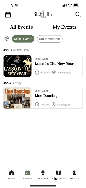
Register for Events
Personalized Onboarding
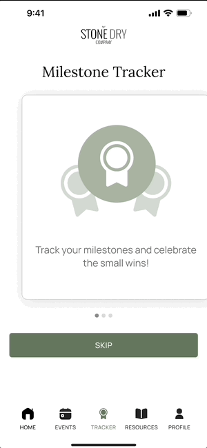
Track Milestones
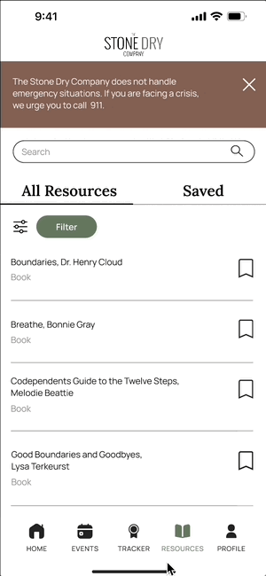
Resource Library
RESEARCH & DISCOVERY
To validate Stone Dry's vision and understand what members actually needed, I conducted user research, competitive analysis, and synthesis to inform our design direction.
2
User Interviewed
Spoke with two individuals in active recovery to understand their current tools, pain points, and what keeps them engaged with Stone Dry.
31
User Surveyed
Collected responses from 31 community members, including active members, leaders, and family supporters, to learn about feature priorities and recovery needs.
6
Competitors Analyzed
Reviewed six existing sobriety apps to identify common strengths, like milestone tracking and daily motivation, and gaps, such as limited personalization and scattered resources.
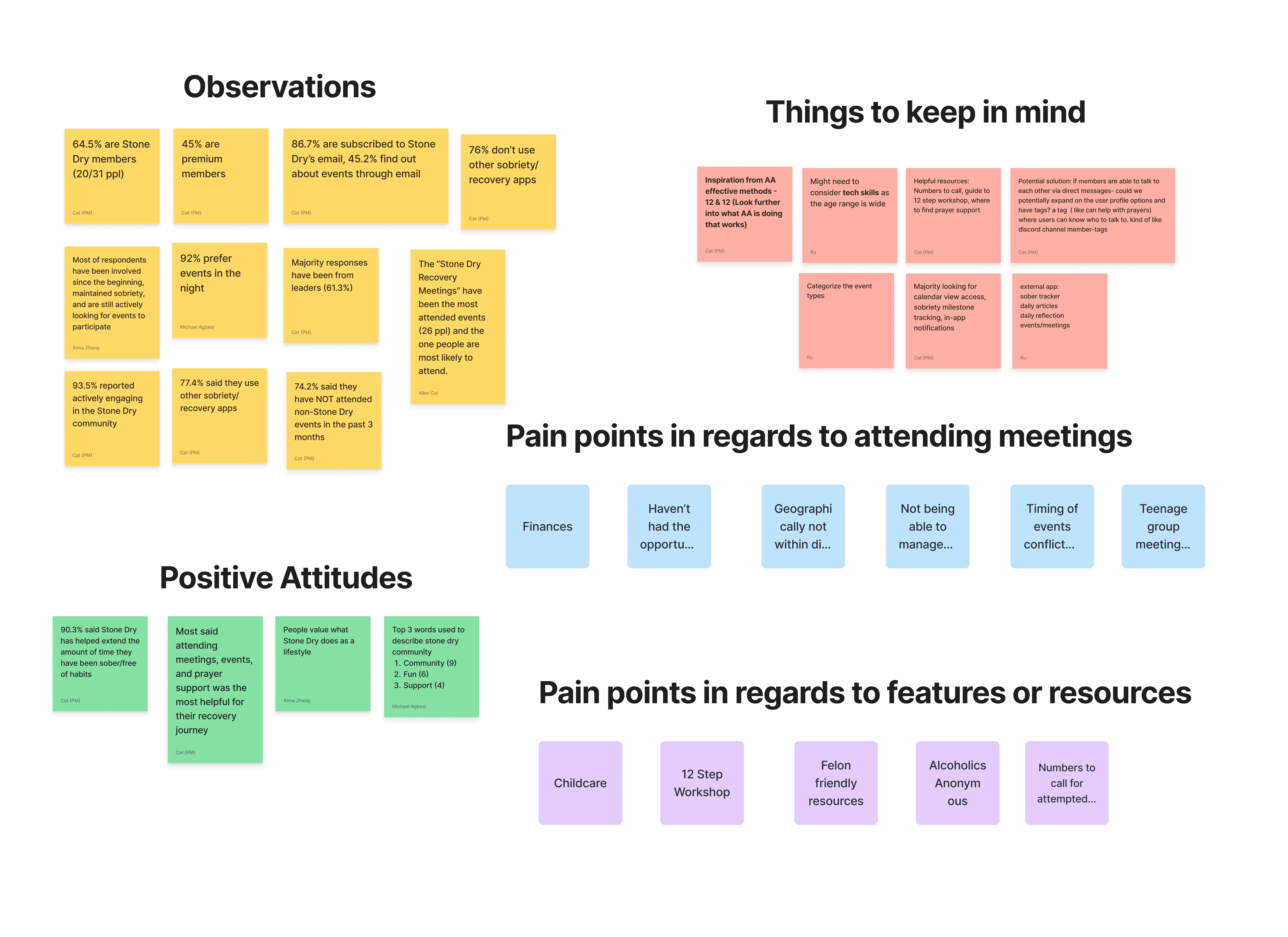
KEY FINDINGS
To validate Stone Dry’s vision and understand member needs, I conducted user research, competitive analysis, and synthesis to uncover key insights. These findings became critical discussion points during internal team meetings and helped shape the strategic direction of the product. The insights ultimately informed several core design decisions and guided the development of key features within the app.
Community is the foundation of participation
Our research showed that community and connection play a major role in members’ recovery journeys. Based on this insight, I designed the community section to feel welcoming, supportive, and easy for members to engage with and share encouragement.
Supporting Both Faith-Based and Personal
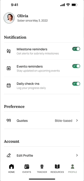
Research revealed that while many members resonated with Stone Dry’s faith-based foundation, not everyone identified with religious content. To create a more inclusive experience, I designed an option that allows users to choose between faith-based quotes or general motivational quotes.
LOW FIDELITY PROTOTYPING
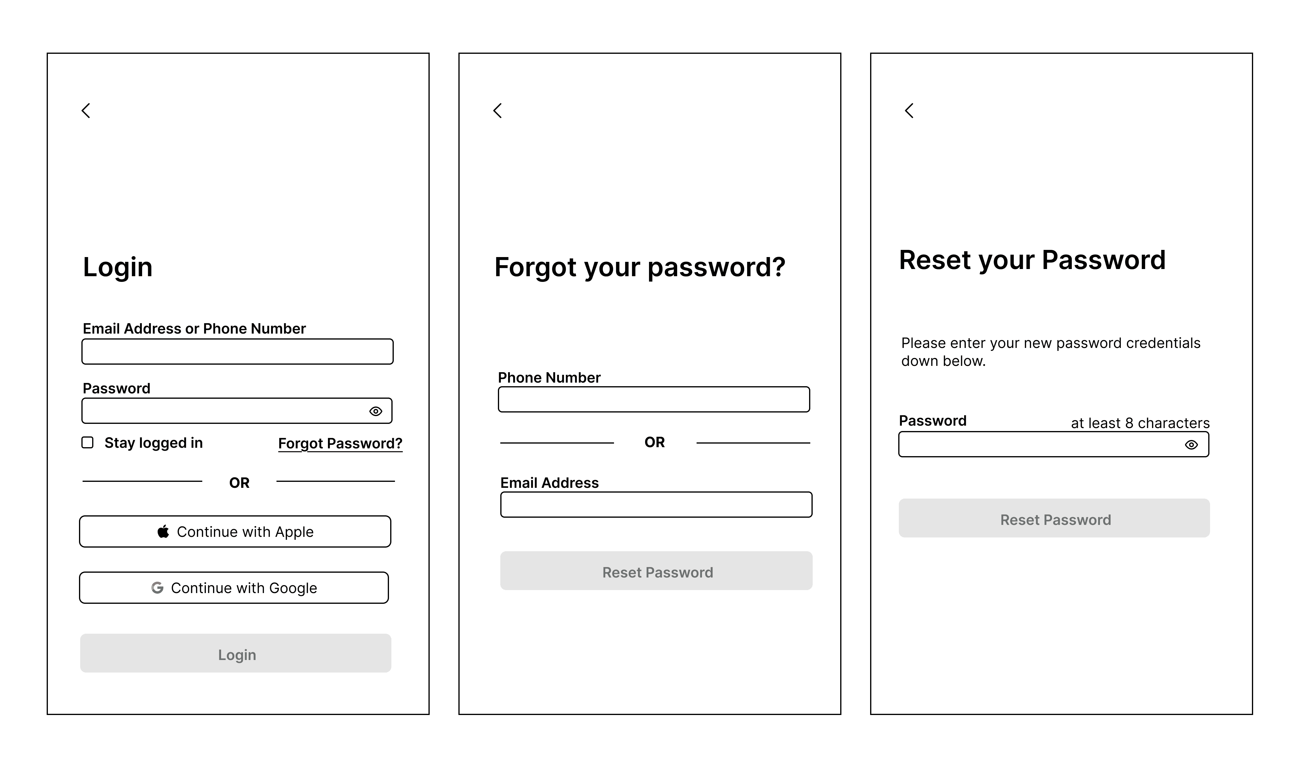
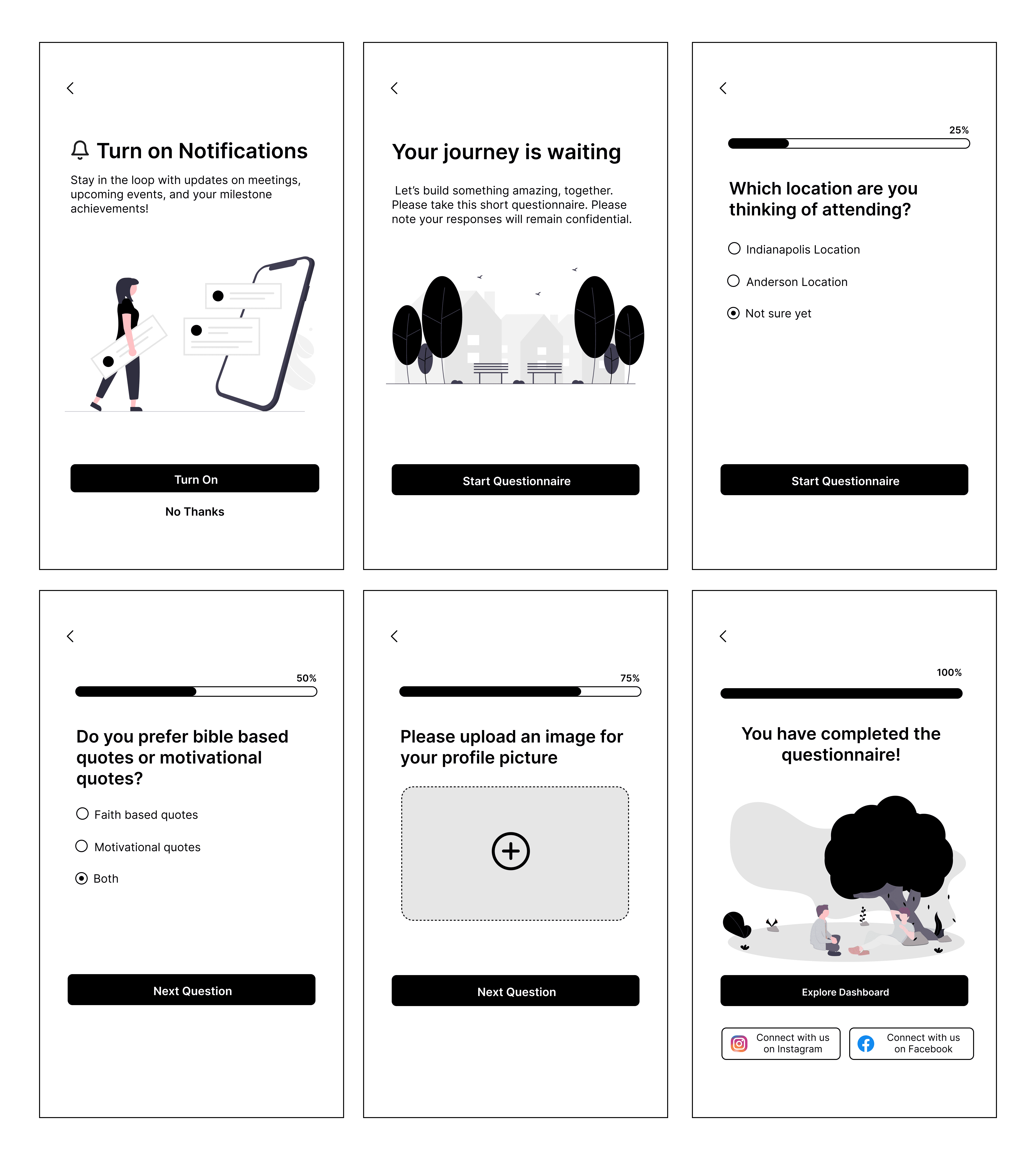
I took ownership of the onboarding, signup, and login flows, the first screens users see when they open the app. Since first impressions matter, I focused on making these screens easy to understand, welcoming, and respectful of users' privacy concerns.
I started with low-fidelity wireframes to quickly test different layout options and information hierarchy. The goal was to answer:
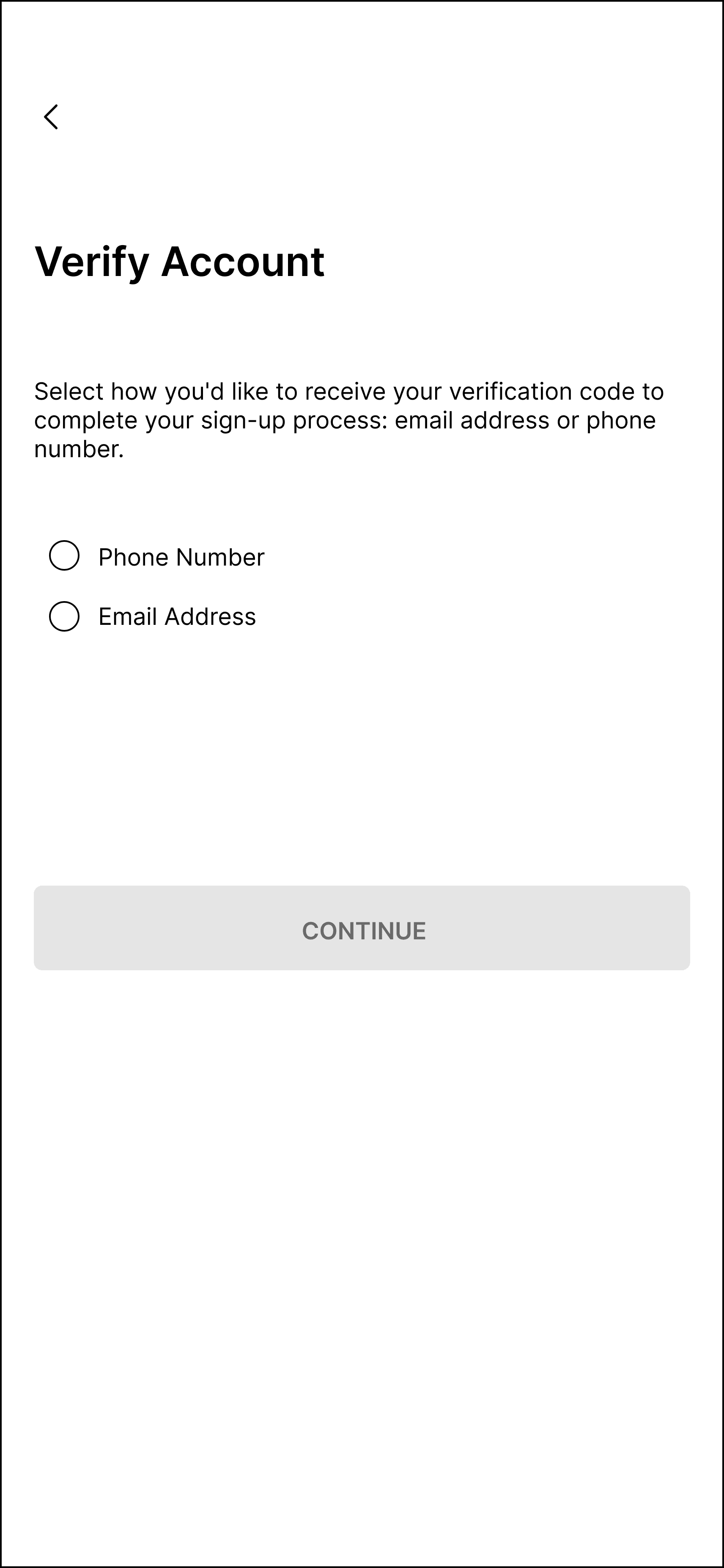
SIGN UP SCREENS
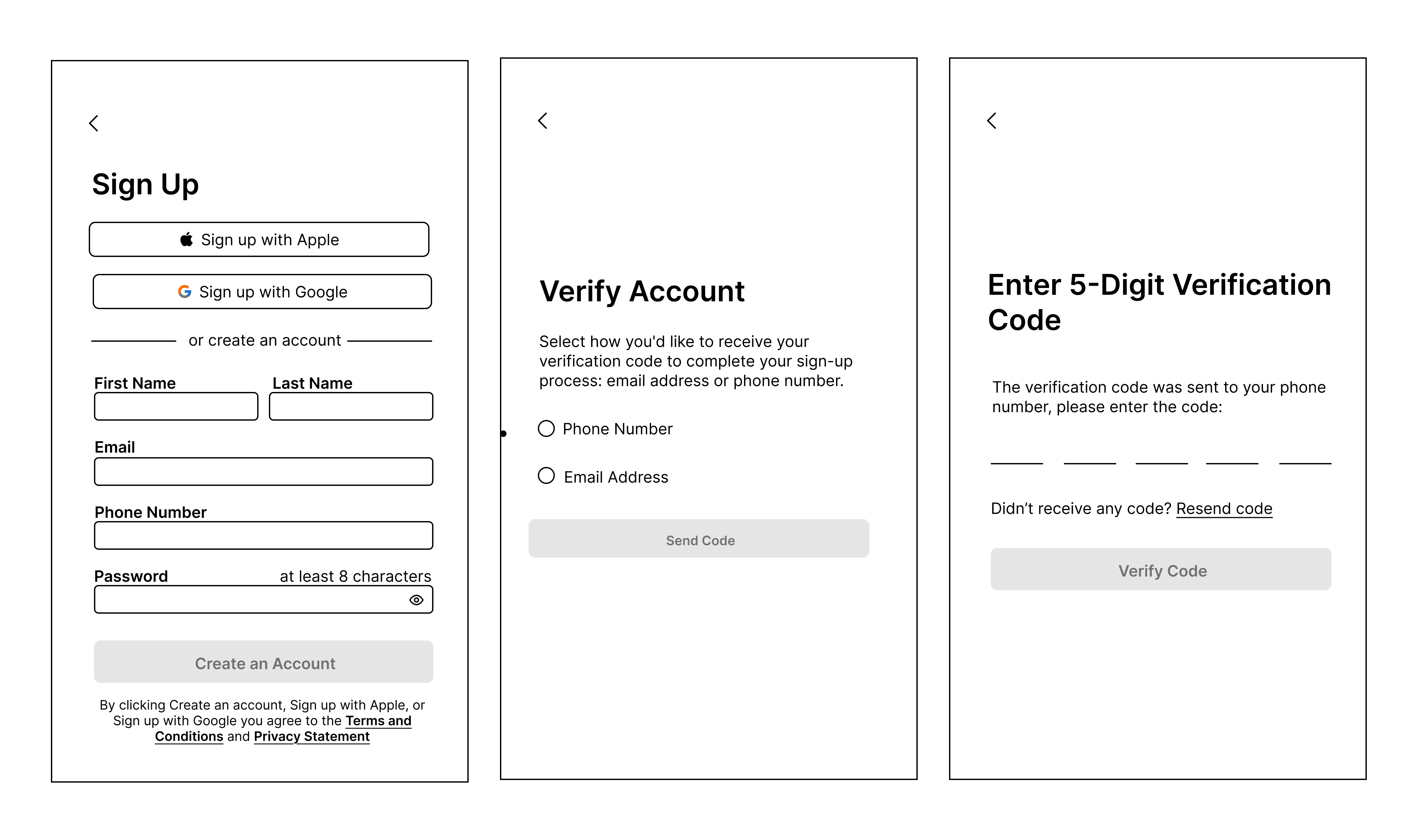
LOGIN SCREEN:
ONBOARDING SCREEN:
ITERATIONS
Throughout development, our team conducted internal design critiques, providing feedback on each other’s work to maintain a cohesive experience. This collaborative process led to several iterations that refined key features and improved usability
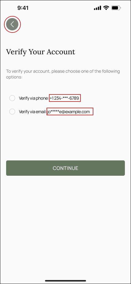
Iteration 1 — Clearer Account Verification
I added masked versions of the user’s phone number and email to clarify where the verification code would be sent, reducing confusion. I also made the back button more visually distinct so users could exit the process more easily.
BEFORE:
→
AFTER:
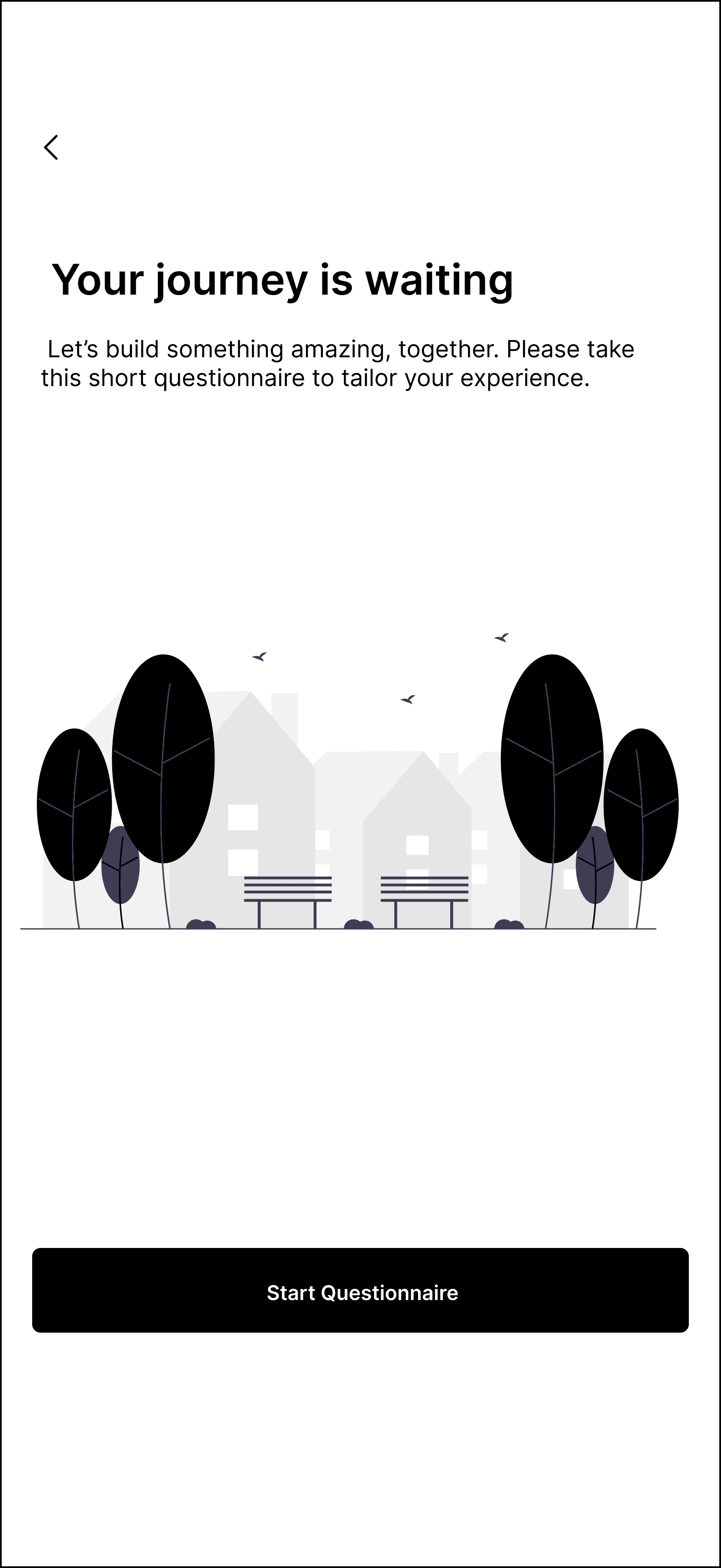
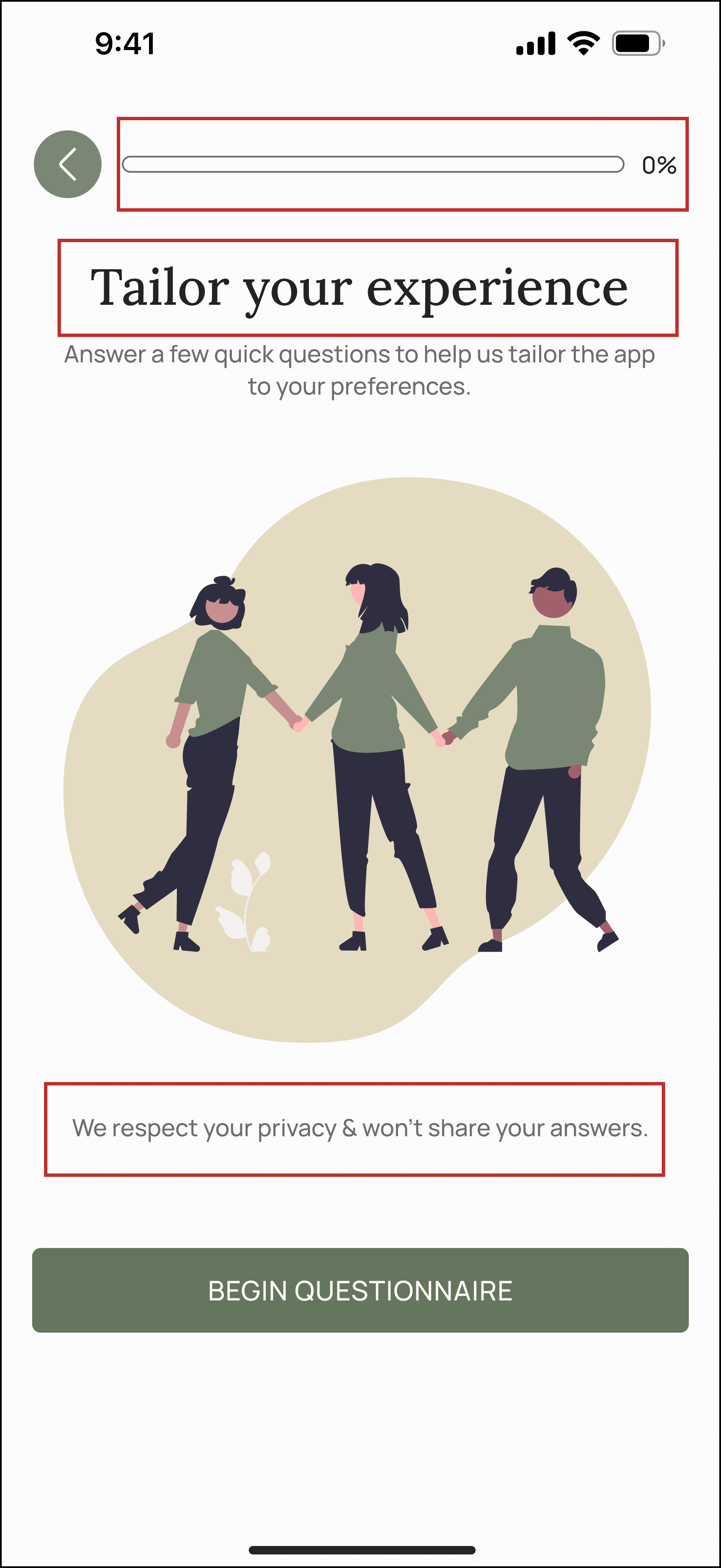
Iteration 2 — Clearer Onboarding Expectations
I moved the progress bar to the beginning of onboarding to give users a clearer sense of the process length and reduce uncertainty. I also updated the heading to “Tailor your experience” to emphasize personalization and added a privacy assurance message to build trust.
BEFORE:
→
AFTER:
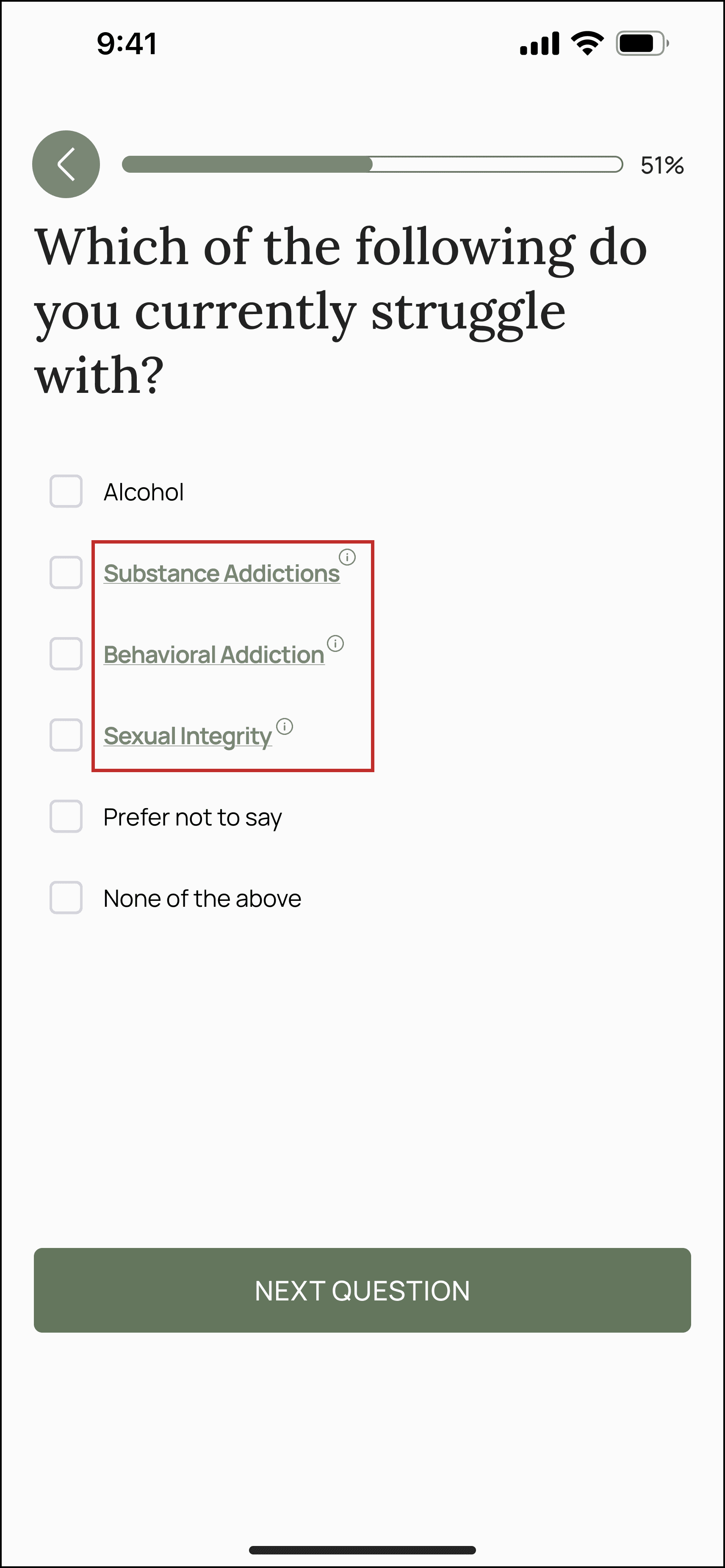
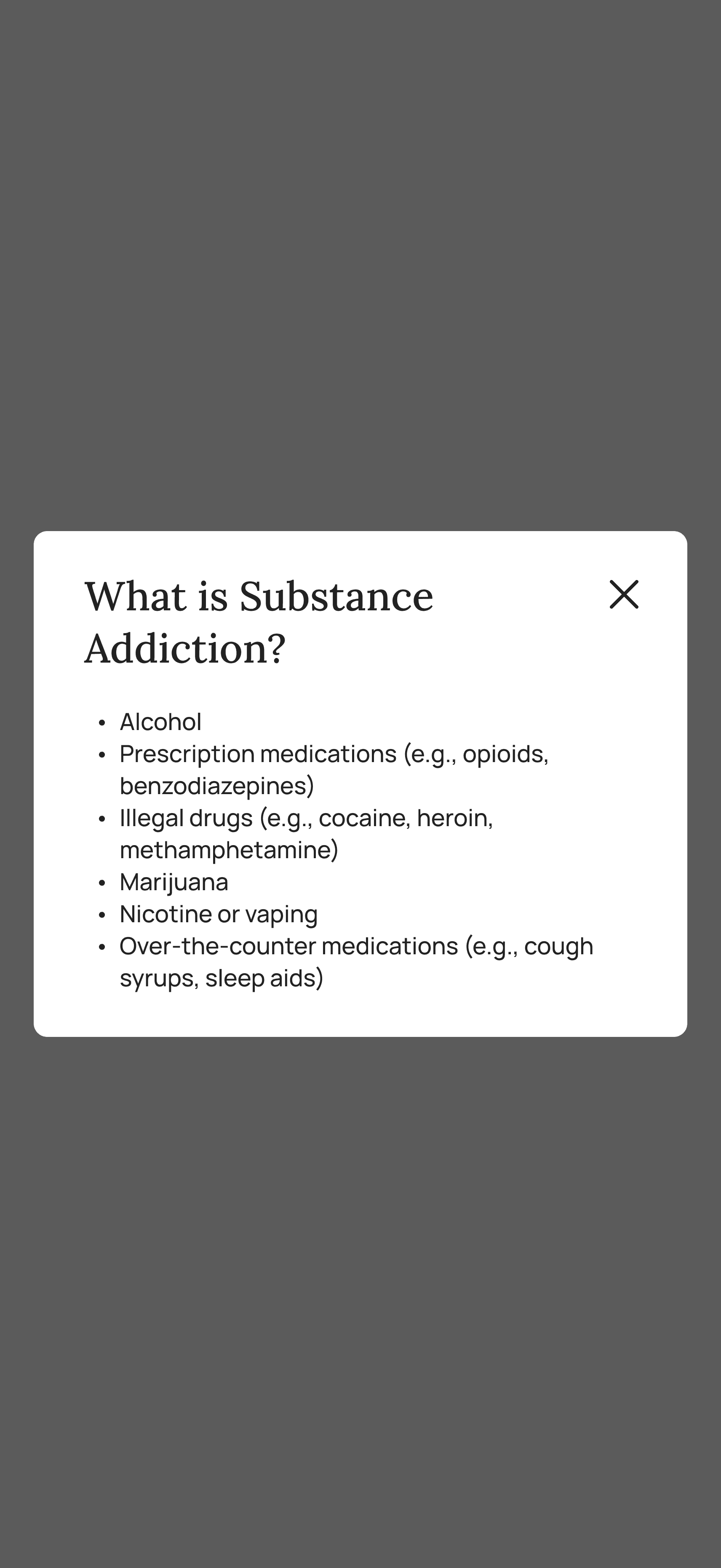
Iteration 3 — Reducing Cognitive Overload
Including too many specific struggles in the onboarding quiz made the interface feel overwhelming. I grouped related items under broader categories and added an info icon that reveals additional details in a small overlay when tapped.
→
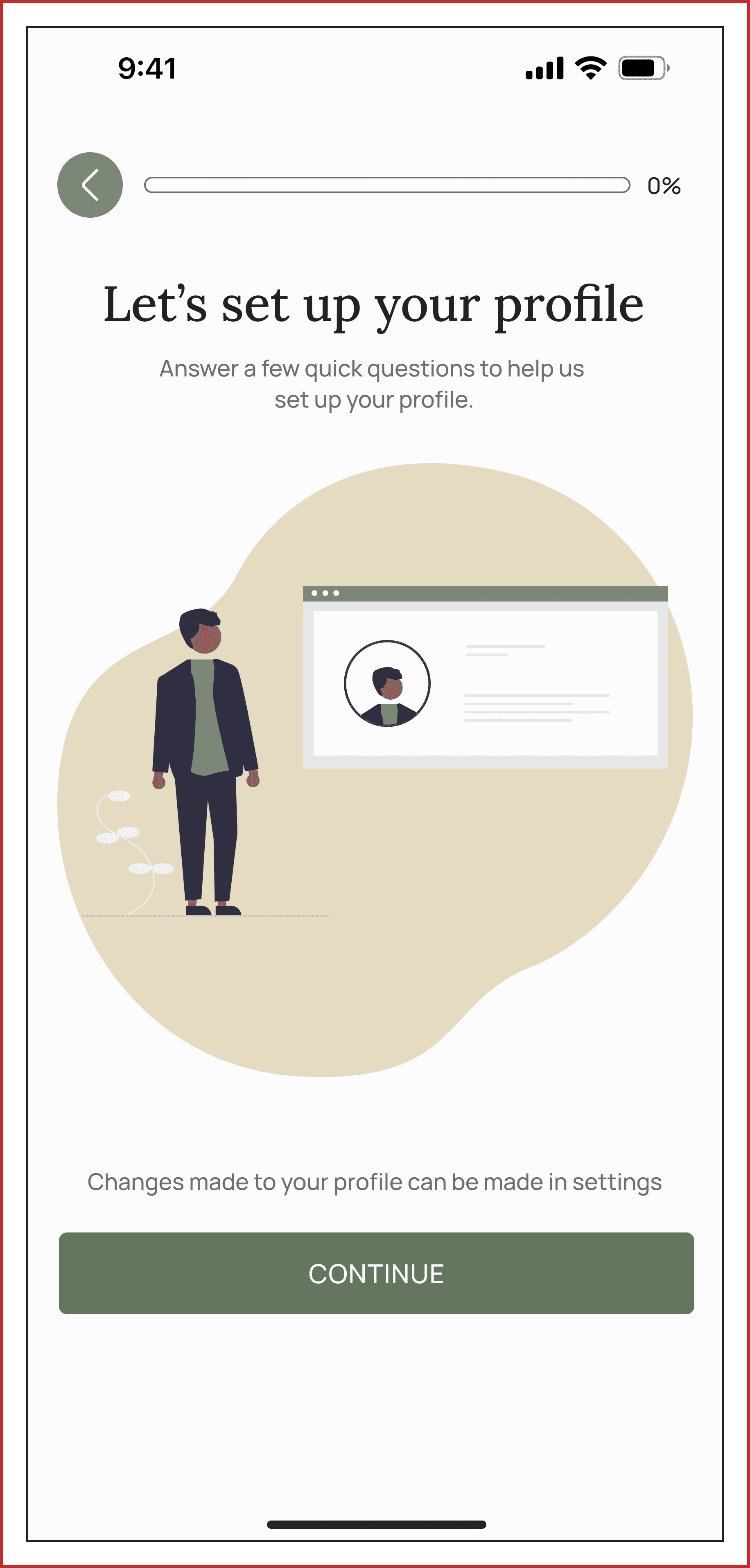
Iteration 4 — Improving Onboarding Structure
I grouped profile-related questions into a dedicated section called “Let’s Set Up Your Profile” to create a clearer structure and help users move through onboarding more intuitively.
PROTOTYPING
Signing up:
Onboarding Quiz:

Profile Setup:

More High Fidelity Protoypes
These screens were made by other designers on the team and you can see how some of them flow together in the following prototype. Although I didn't work on these, I wanted to show the breadth of features we had.
Resource View:
Event View:
Dashboard View

Set Milestones:
User Profile:
TESTIMONIAL

Stephanie Nashert
Founder of Stone Dry
Working with Develop for Good to build the Stone Dry app was an awesome experience. Our team is so talented, super patient, and just overall great to work with. From day one, they really listened to our vision and brought it to life in ways we didn’t even think of. The communication was solid the whole way through, and their attention to detail made a huge difference.
Moving from 0 to 1 in App Development
As the design team, we’ve laid the foundation for the mobile app by creating a comprehensive design system and detailed documentation to guide the next phases of development.
To measure the success of the project, we will track the following Key Performance Indicators:
Successful user registration for events through the newsletter
Time spent on the app during first interactions
Frequency of user engagement with the app on a weekly basis
Number of donations made via the app
TAKEAWAYS
Embrace the loops along the way
While attempting to hone in on specific concepts, we found ourselves consistently branching out into additional ideas. Ultimately, we opted to concentrate on the most crucial aspect: addressing user issues, and formulated respective resolutions for each.
Design-to-development handoff
Through this experience, I gained a deeper understanding of the design-to-development handoff process. I learned the importance of systematically naming components within libraries and using auto-layout to ensure accurate paddings and margins.
Big shoutout to my awesome team!