PROJECT OVERVIEW
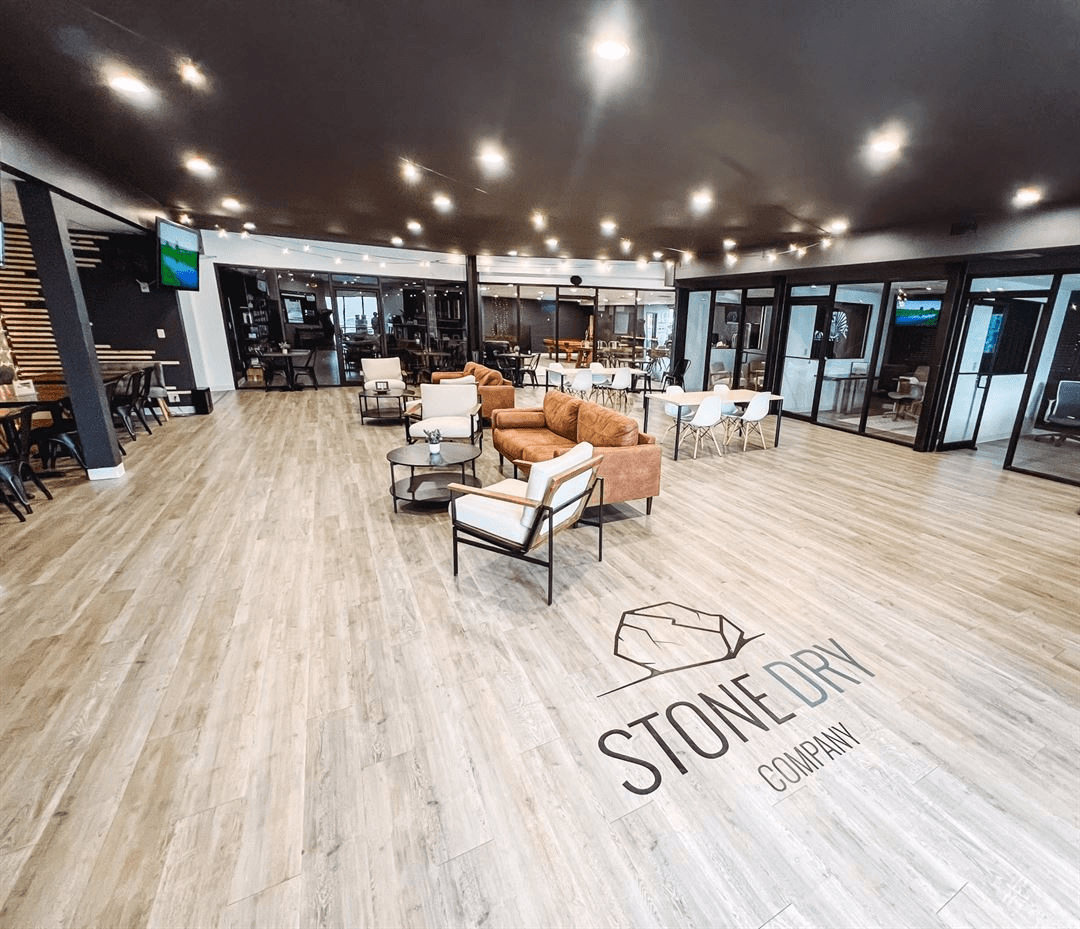
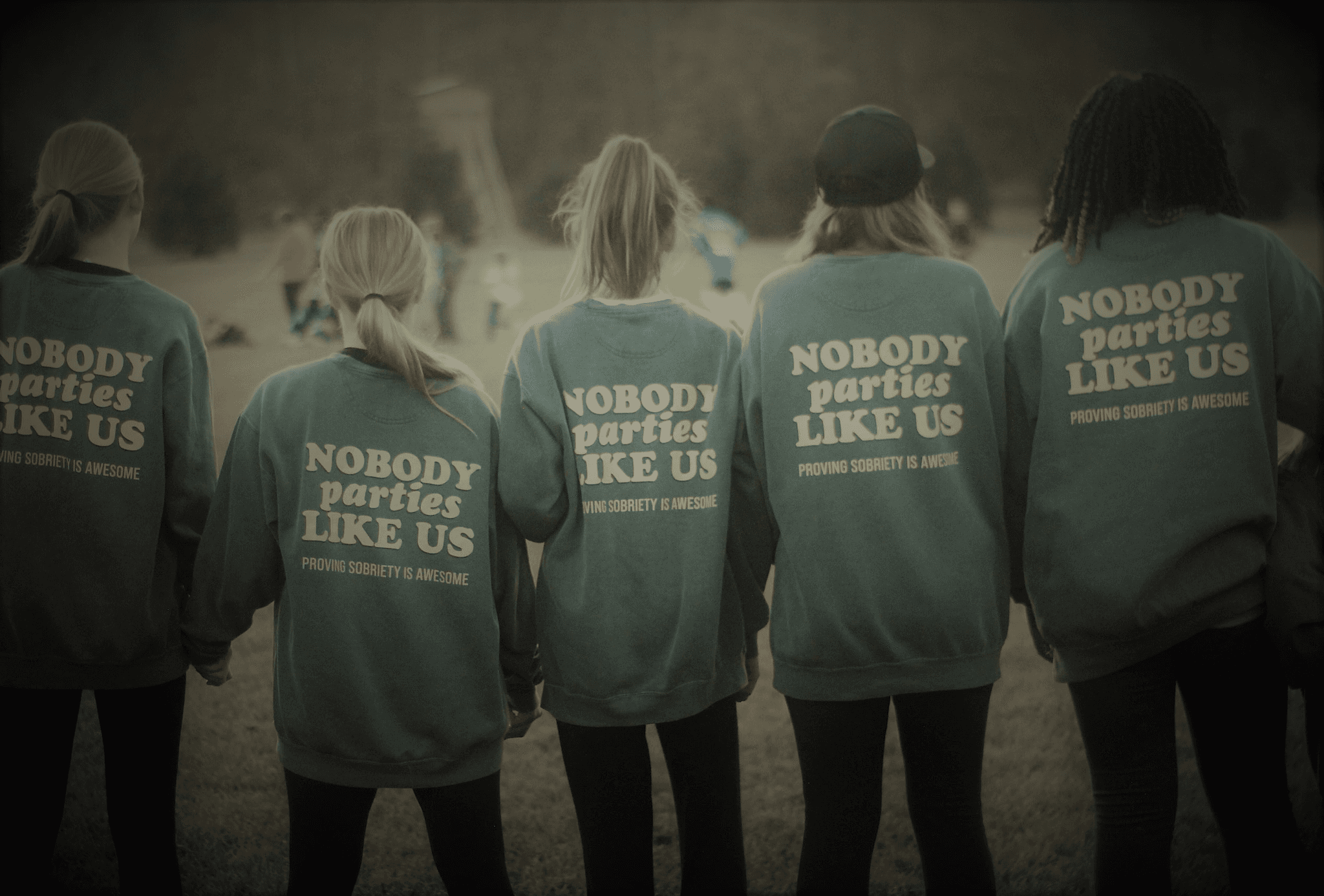
WHAT IS STONE DRY?
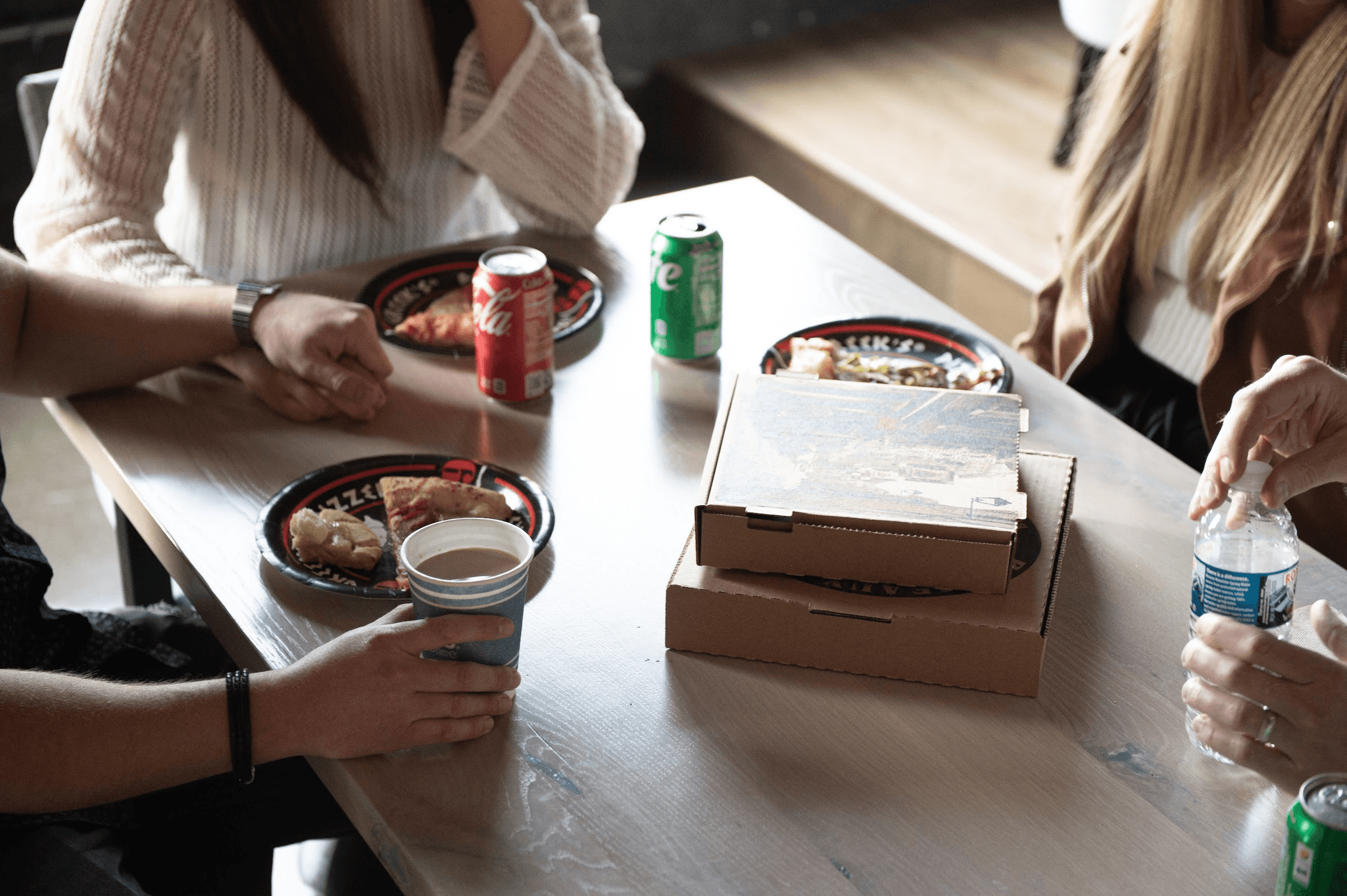
A non-profit supporting individuals on their sobriety journey by fostering community and providing resources for recovery.
Through Develop for Good, an organization that connects volunteers with nonprofits to create meaningful technology solutions, I worked on this project for Stone Dry to create a "one stop hub" for sobriety support.
THE CHALLENGE
DEFINING THE PROBLEM
Stone Dry recognized a gap in accessible resources for individuals on their sobriety journey.
Many in the Stone Dry community faced challenges in finding a centralized place that provided all the tools and information needed for their sobriety journey. Without a single, reliable source of support, they often had to navigate multiple platforms and resources, making the process overwhelming.
THE SOLUTION
MAKING SOBRIETY SUPPORT MORE ACCESSIBLE
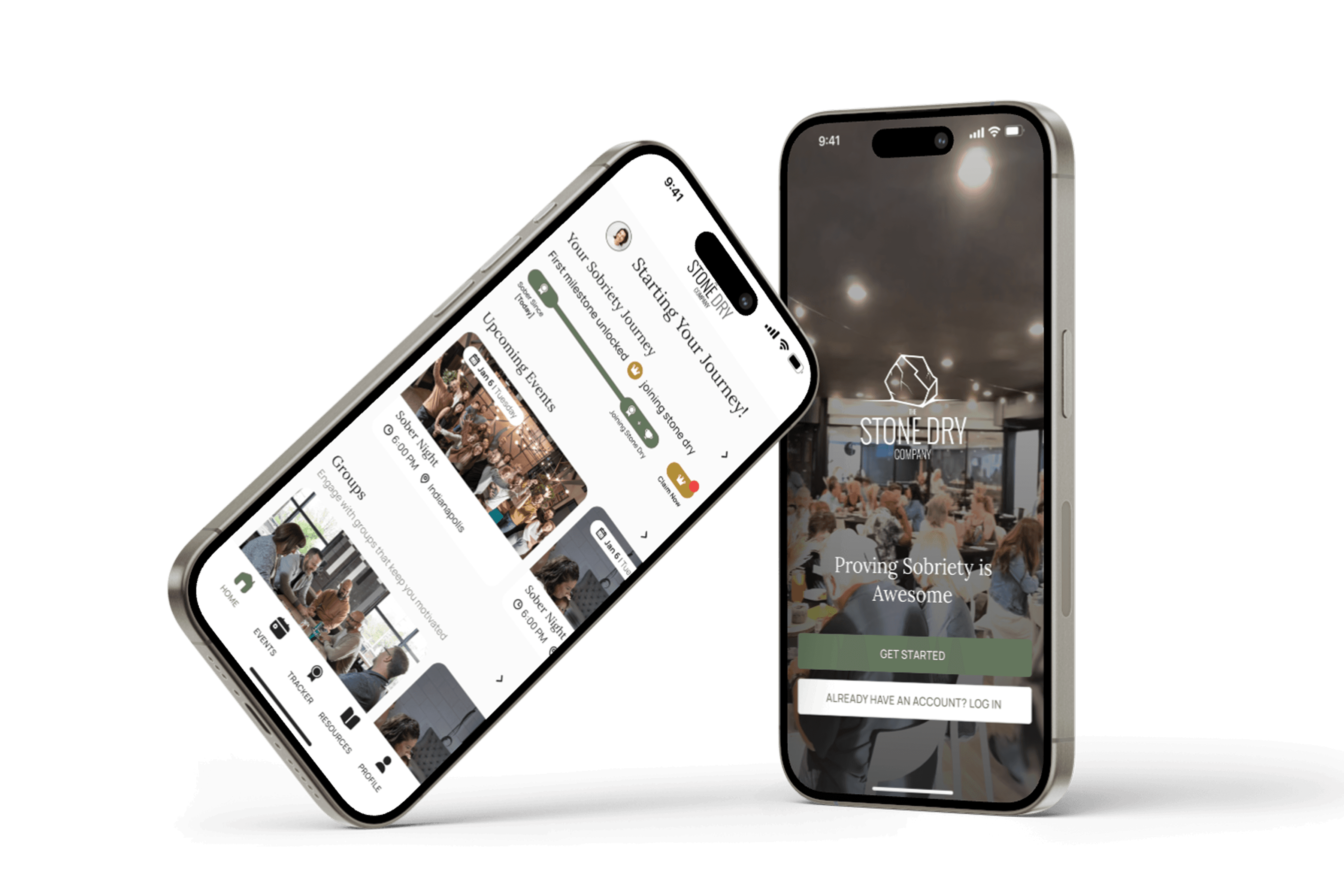
The Stone Dry app bridges the gap by offering a comprehensive, all-in-one platform that equips individuals with the tools, resources, and support they need to navigate their sobriety journey with confidence.
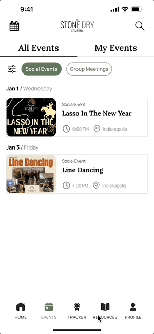
Find Meetings: Easily search for and join sobriety meetings.
Event Registration: Sign up for recovery-focused events.
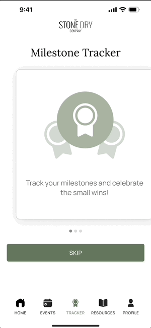
Milestone Tracking: Celebrate and monitor sobriety progress.
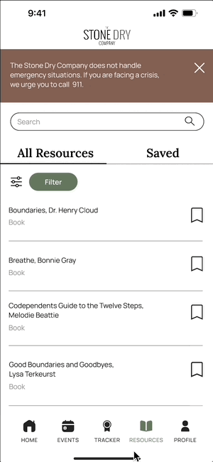
Resource Access: Explore helpful articles and recovery tools.
This solution aligns with the nonprofit’s mission, fostering community and empowering individuals on their path to recovery.
OUR PROCESS
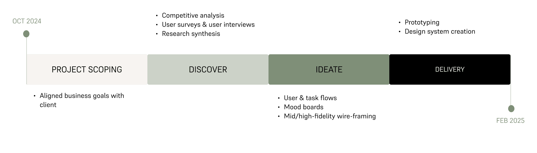
PROJECT SCOPING
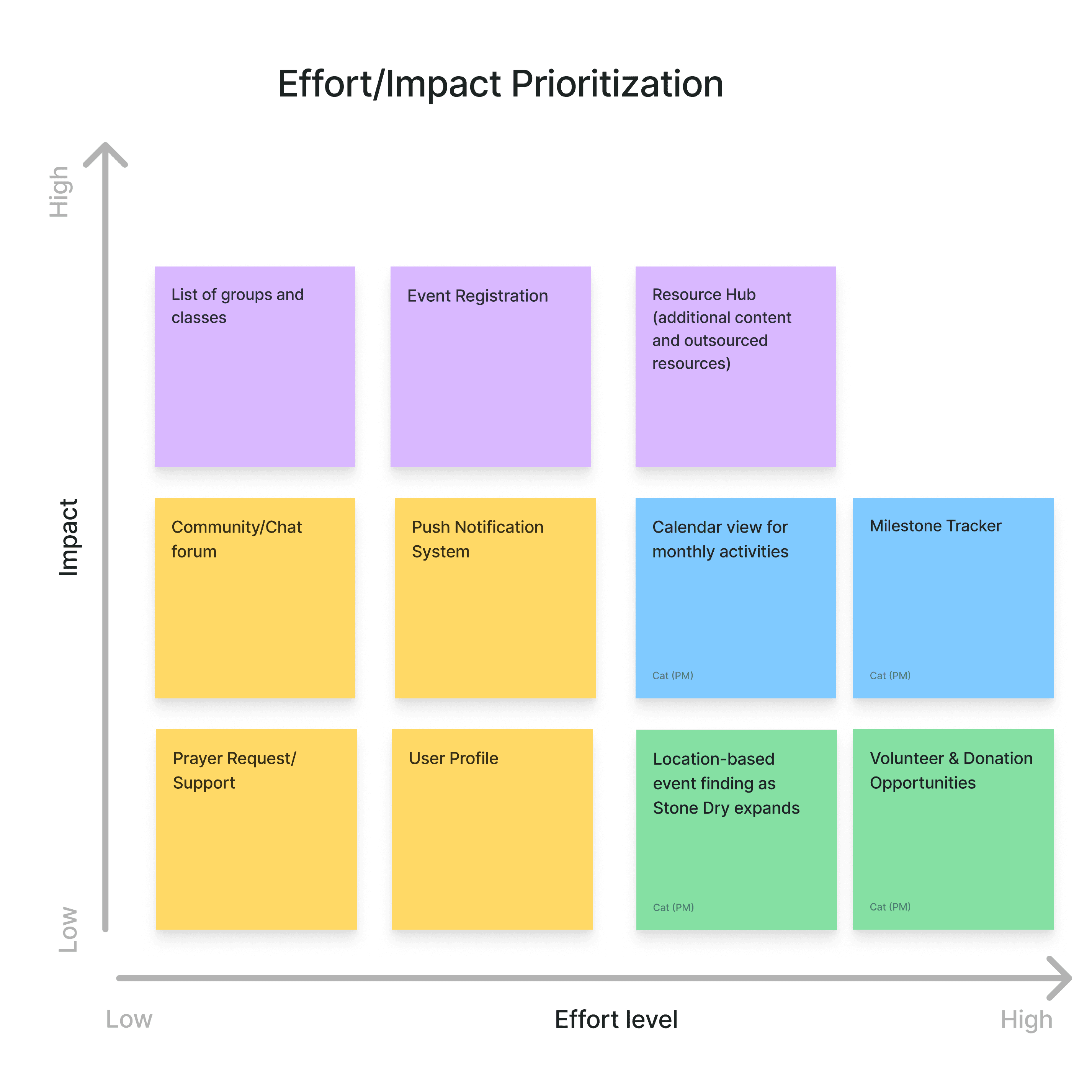
ZEROING IN ON HIGH IMPACT FEATURES
We Prioritizied Features for Maximum Impact and Minimum Effort
We kicked off the project by sorting the client's features into an impact-effort matrix. This helped us prioritize the most valuable features and focus our resources, ensuring we could deliver the product within tight time constraints
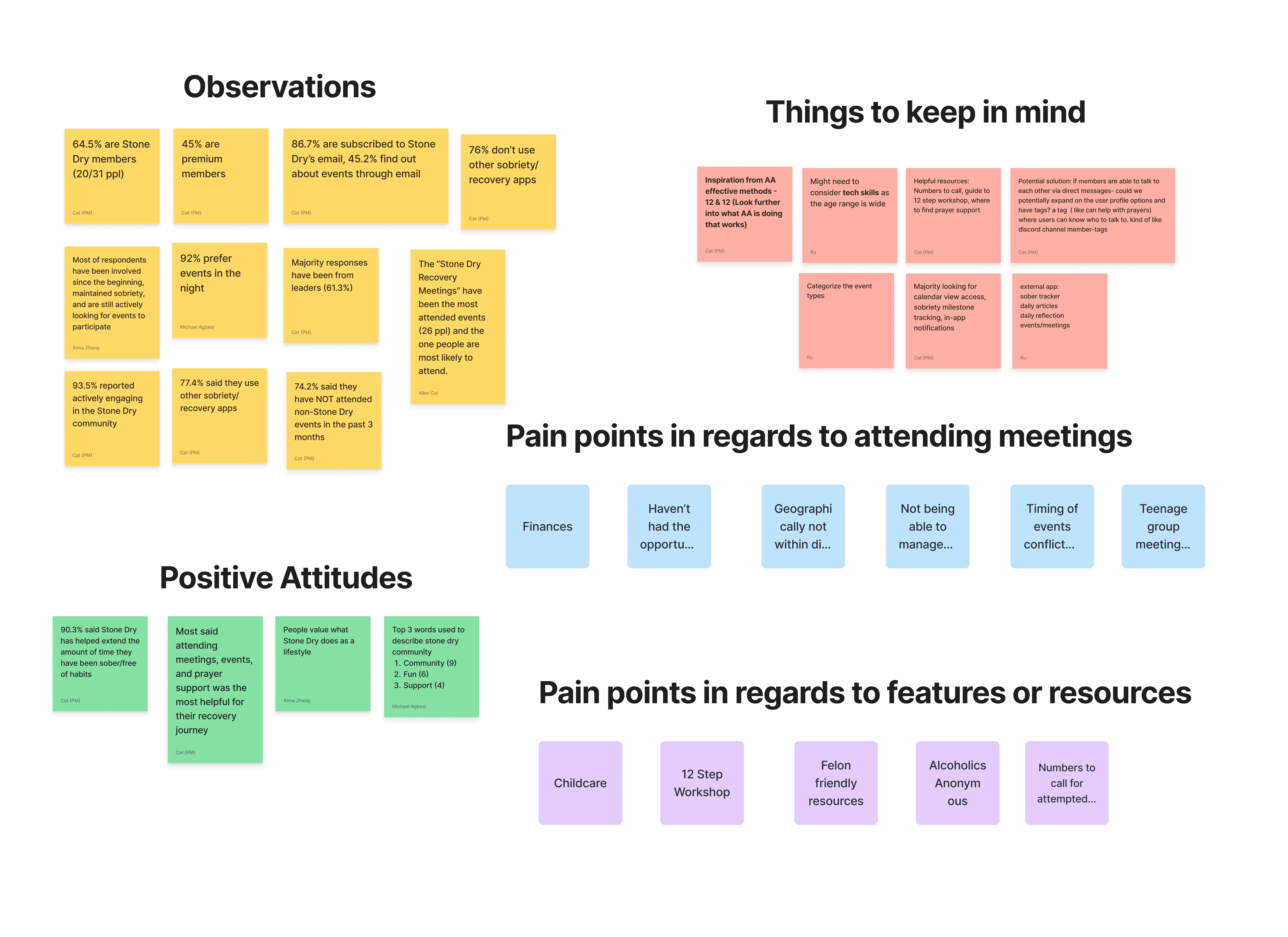
USER RESEARCH
UNDERSTANDING REAL CHALLENGES THROUGH DIRECT USER ENGAGEMENT
We wanted to truly understand our audience, so we dove deep into research to uncover their real challenges.
Our research aimed to understand the real challenges faced by users in the sobriety space. We engaged directly with the community by conducting two user interviews and gathering feedback from 31 survey respondents. By grouping similar insights through affinity mapping, we identified underlying patterns that informed our feature prioritization, ensuring a comprehensive understanding of the users' needs.
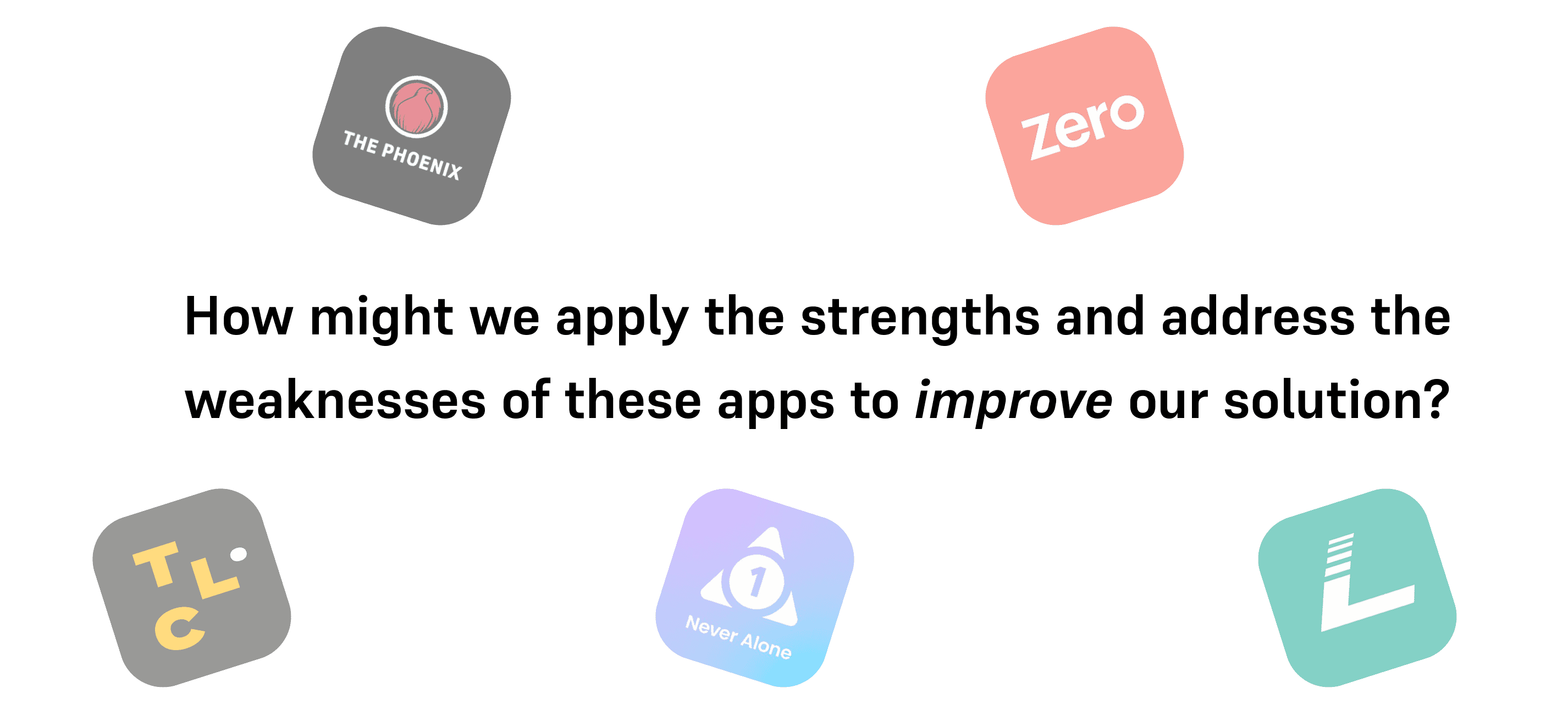
COMPETITIVE ANAYLSIS
We analyzed other applications in the sobriety space
We looked at how other apps structured their features, what worked well, and where there were gaps. This helped us identify opportunities to improve on existing solutions. Through our analysis, we identified key strengths that enhance user experience and common weaknesses that create friction. Understanding these patterns gave us a foundation to build upon.
BRANDING
VISUAL IDENTITY
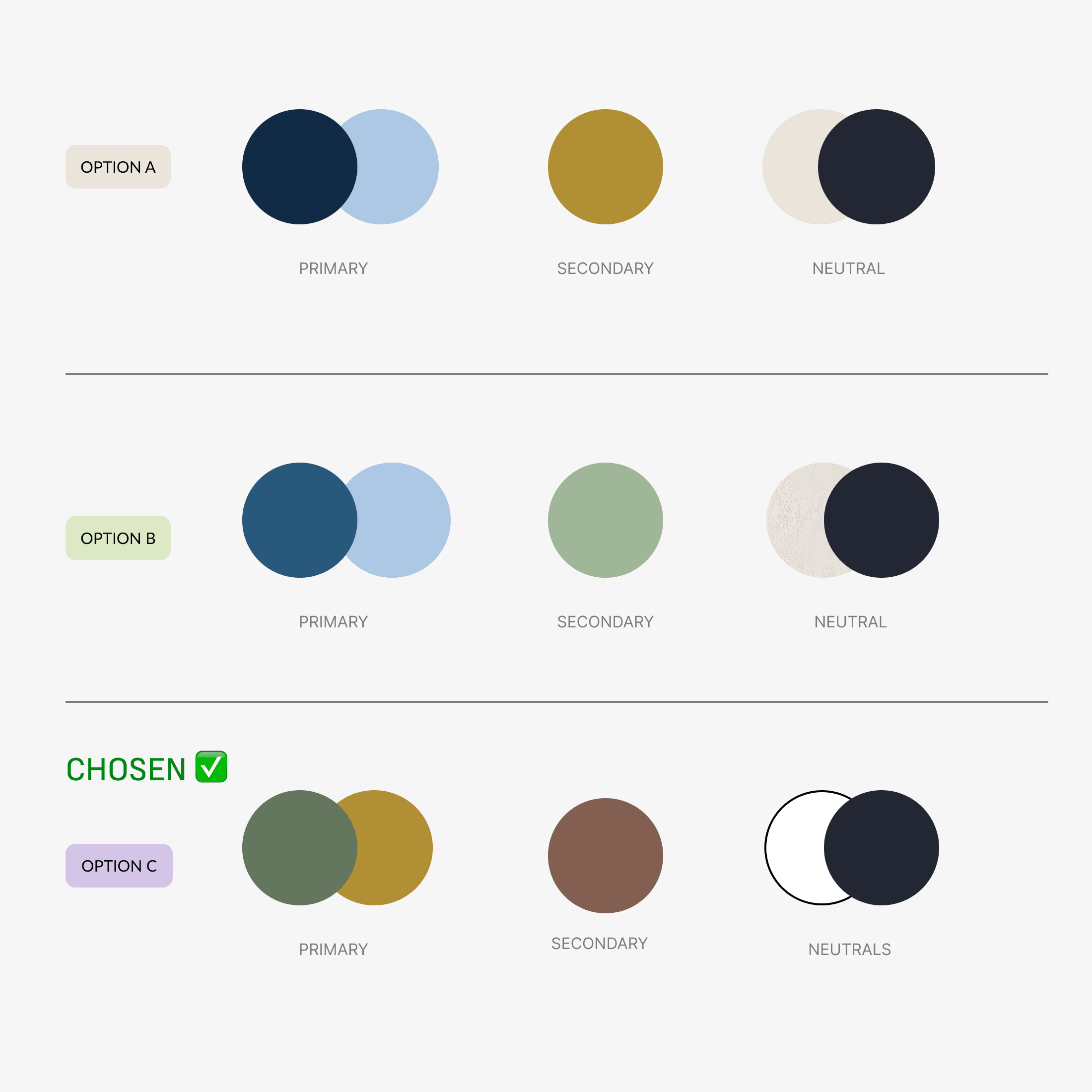
We received mood boards from the non-proft client.
The mood boards served as a key starting point for shaping our color palette, reflecting the nonprofit's aesthetic and the emotions they wanted to convey. They gave us the freedom to get creative, while keeping the mission and values front and center.
Building on these explorations, we curated a range of color options that balanced vibrancy with professionalism.
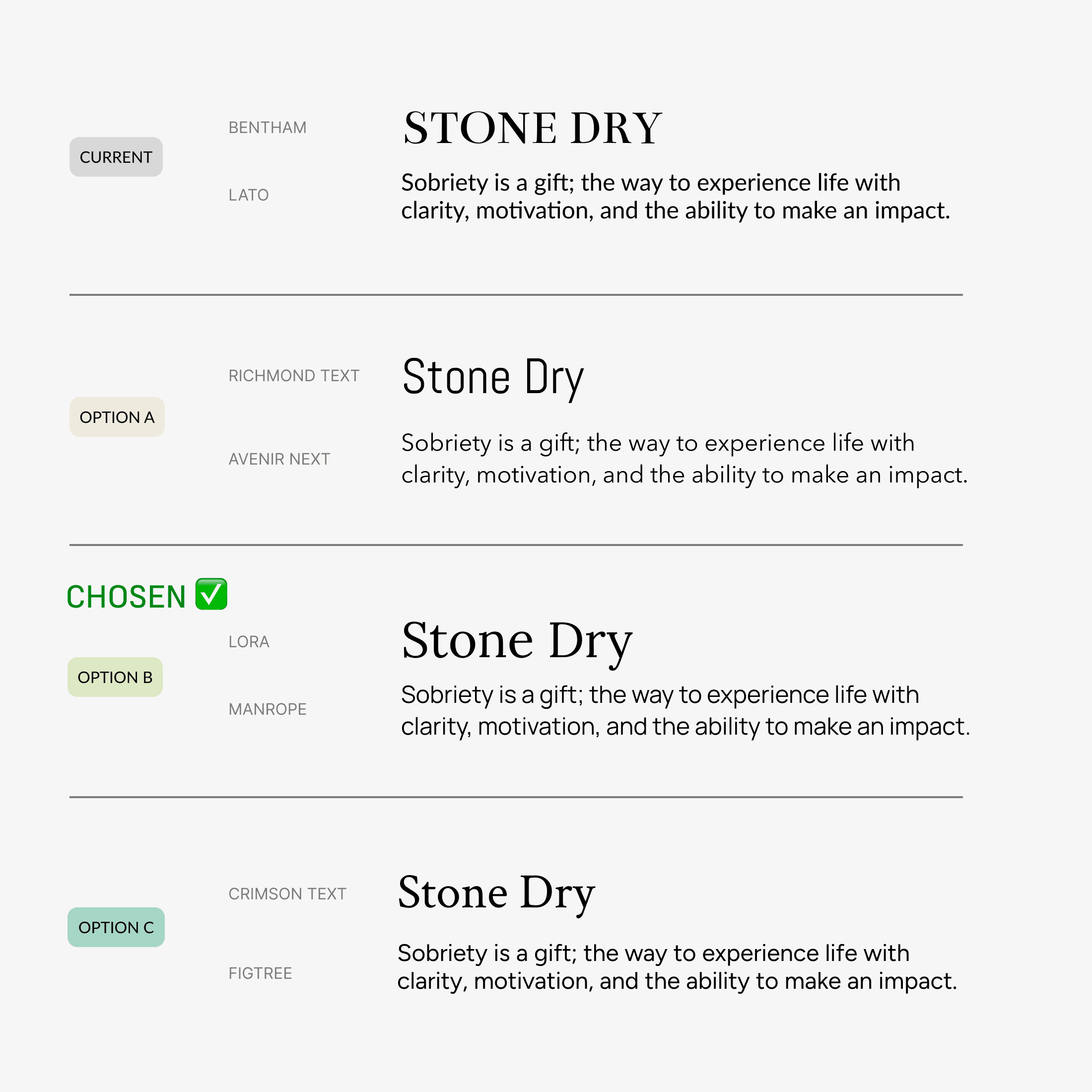
The visual cues from the mood boards inspired us to experiment with different color combinations and design elements, helping us create a cohesive, yet fresh, palette. We also selected fonts that complemented the palette, reinforcing the brand’s tone and enhancing the overall visual identity.
IDEATION
LOW FIDELITY PROTOTYPING
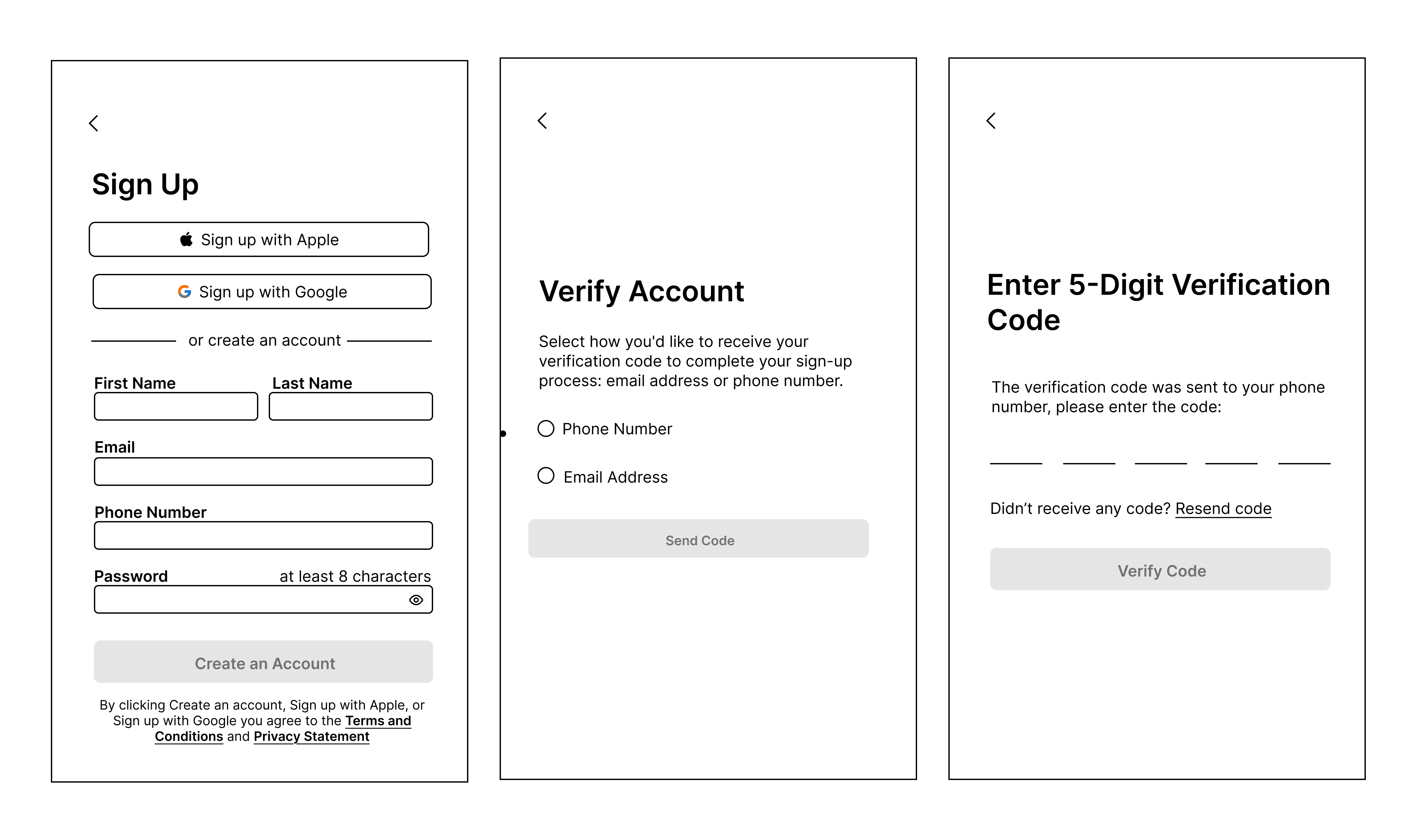
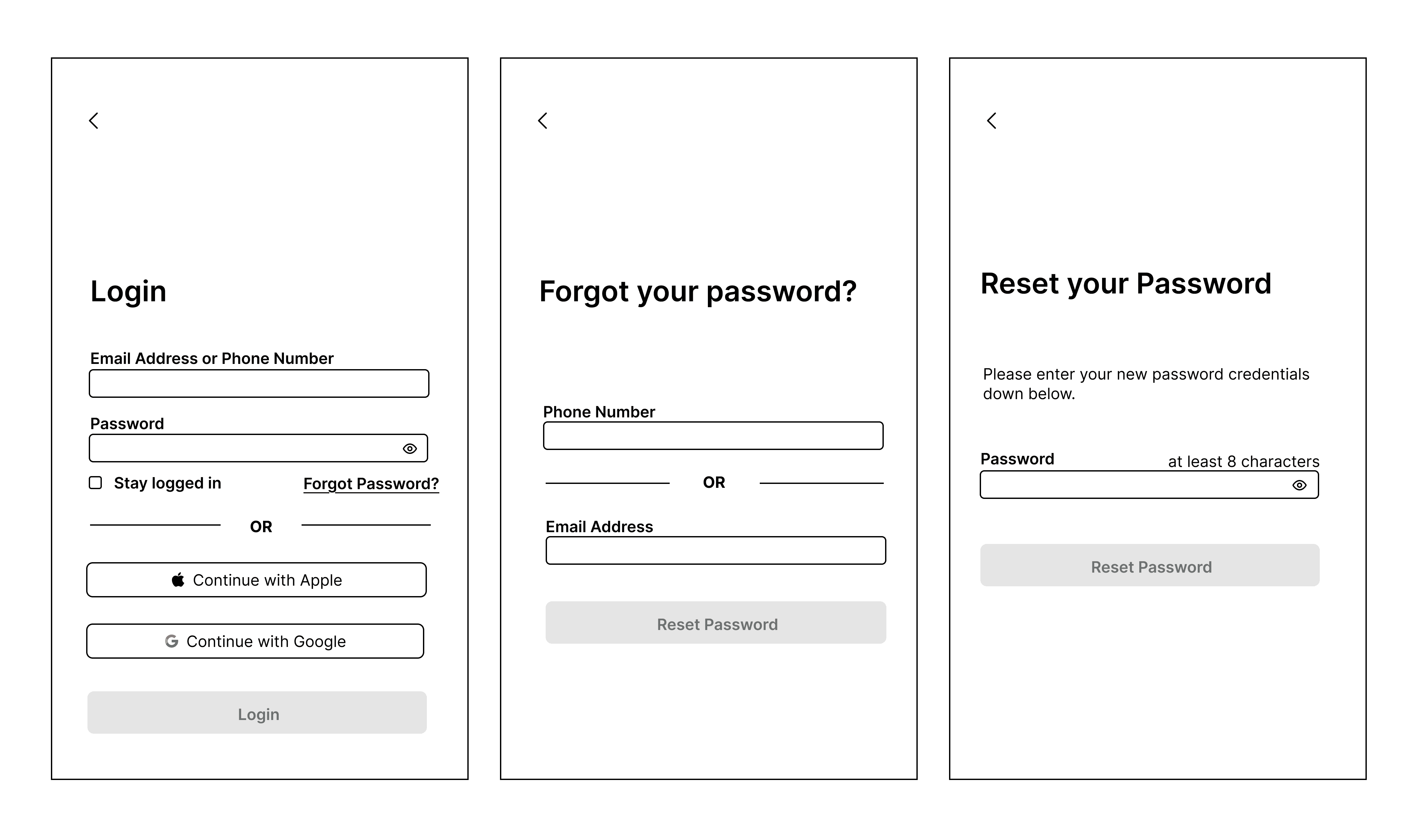
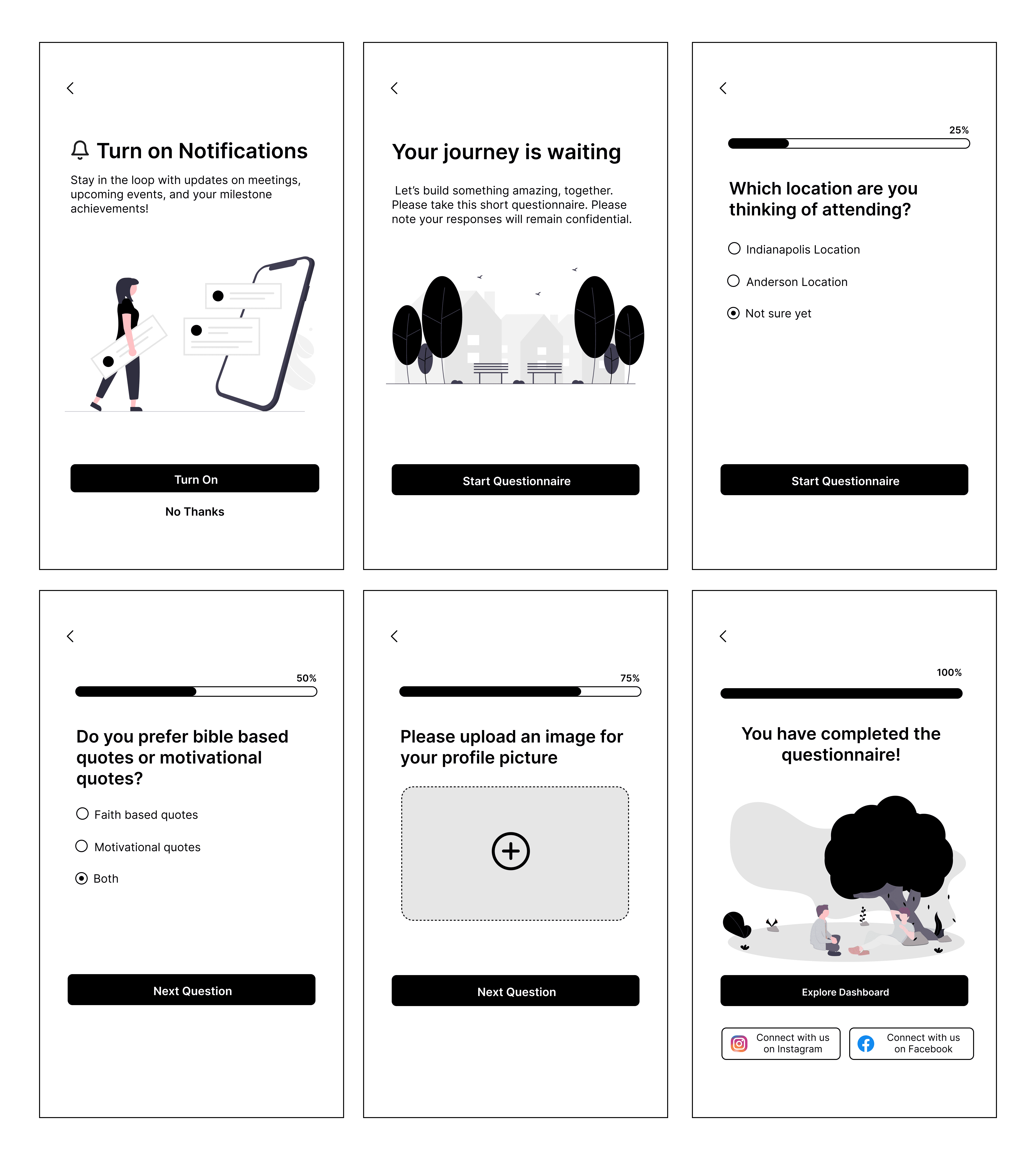
I took ownership of the login and welcome screens, as well as the onboarding process.
My focus was on making sure these screens were easy to understand and navigate, helping users quickly get started with the app without confusion. Since the first impression of an application can make or break the user experience, it was important to design an engaging onboarding flow that sets the right tone from the start.
Sign Up Screens:
Login Screens:
Onboarding Quiz Screens:
ITERARTIONS
USABILITY TESTING
Making Iterative Changes
We tested the app with our nonprofit client and our internal team of six, refining its features based on their feedback to enhance the user experience.
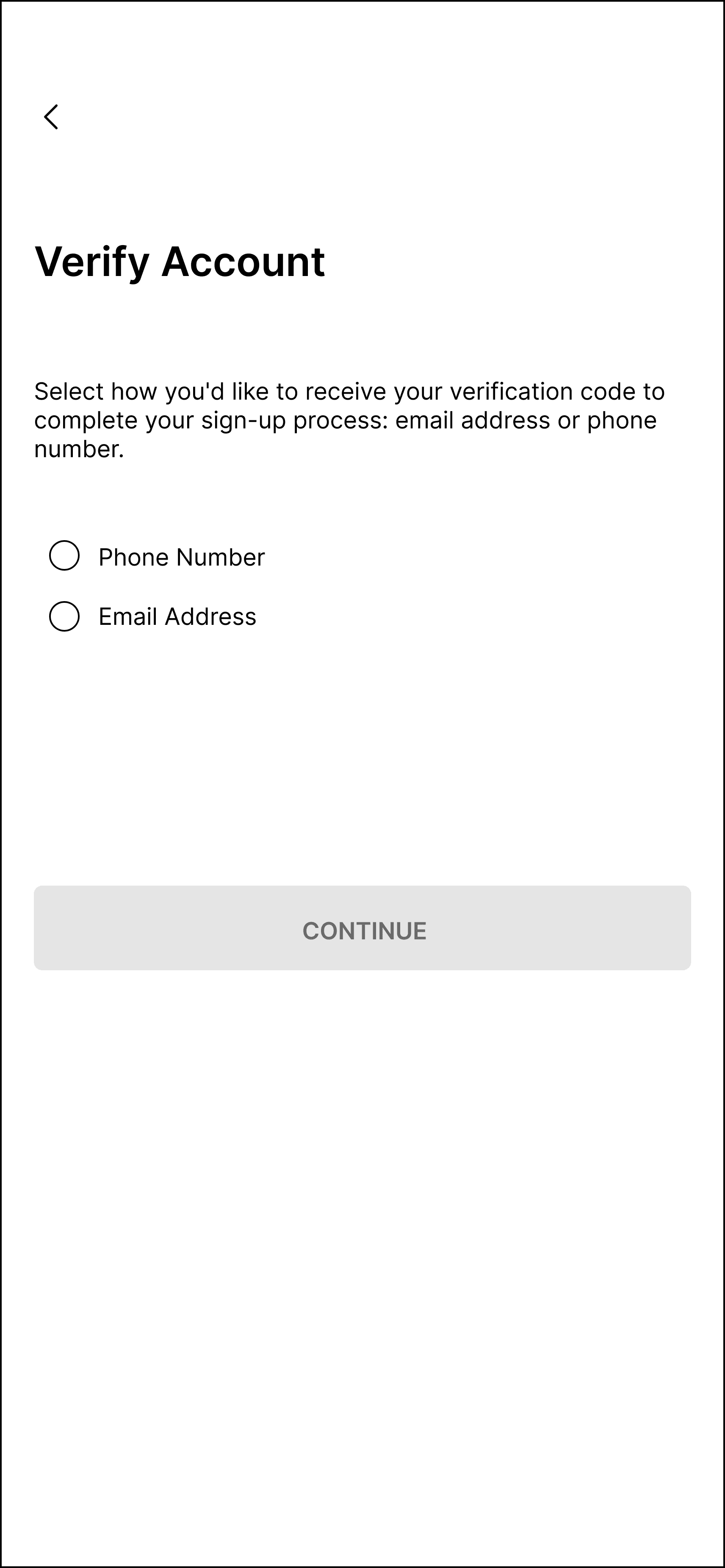
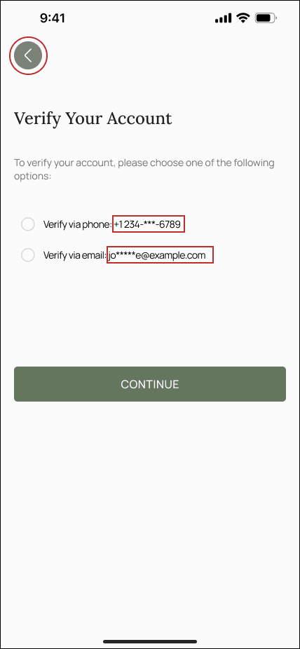
CHANGE #1: I added a masked version of the user's phone number and email to clarify where the verification code will be sent, reducing confusion. I also made the back button more distinct to help users exit the process more easily.
BEFORE:
→
AFTER:
Profile Setup:
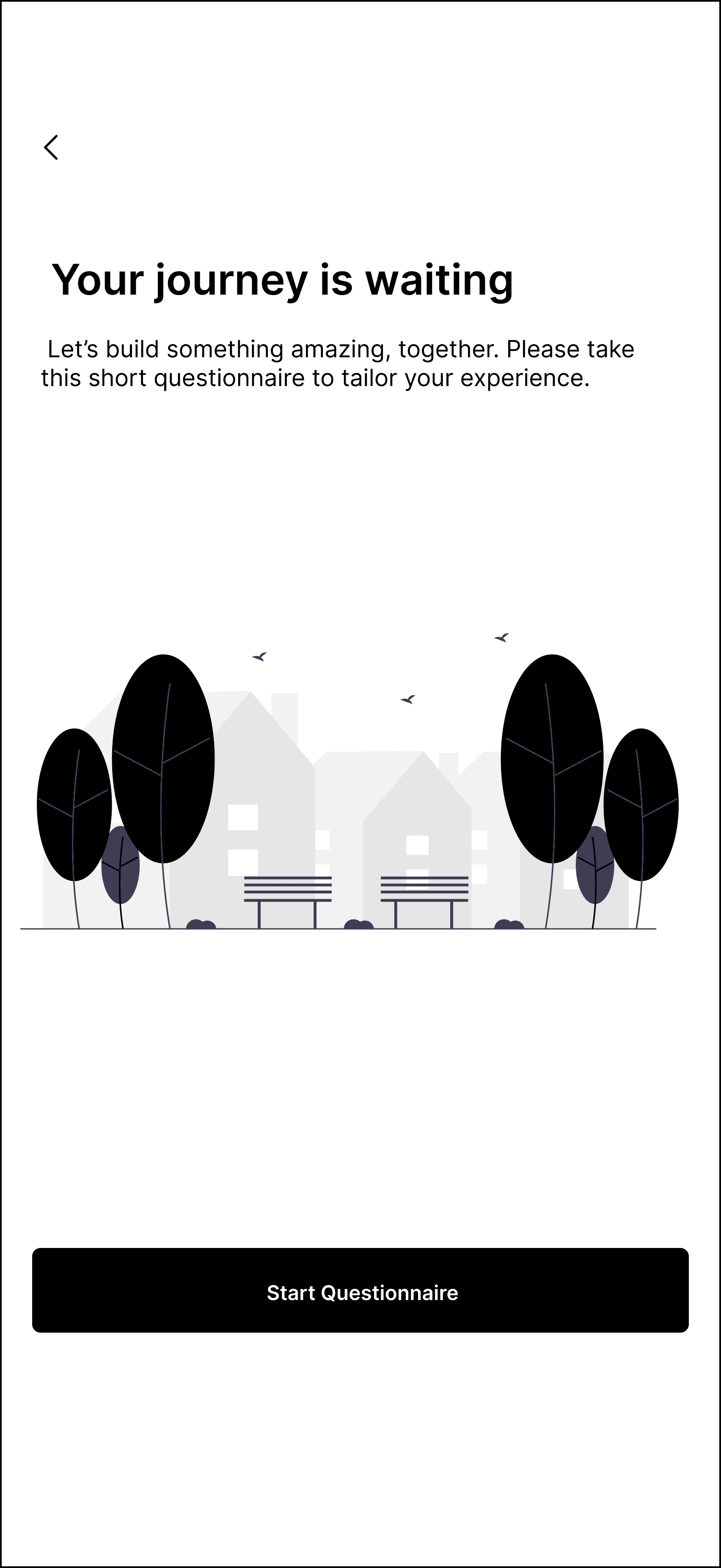
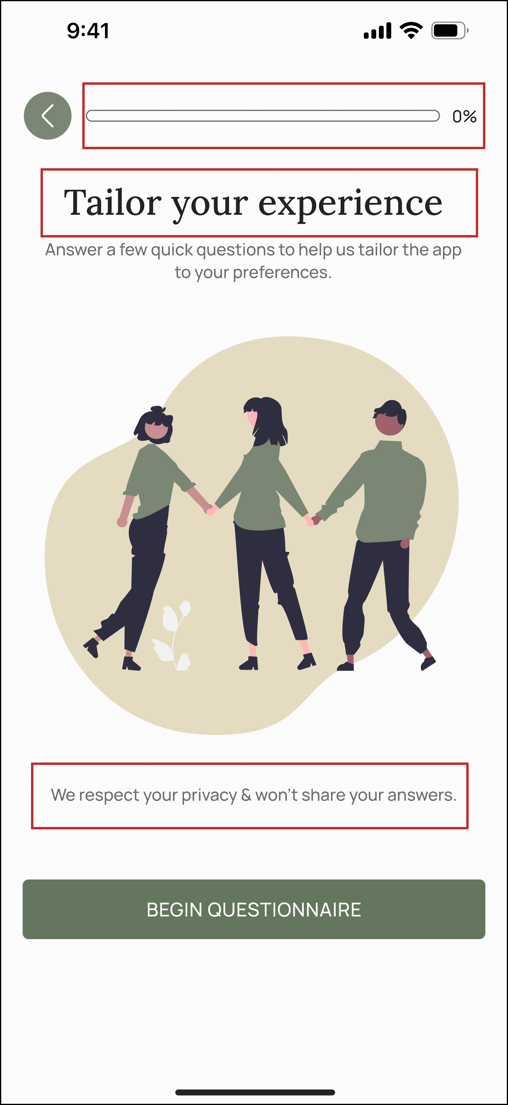
CHANGE #2: I moved the progress bar to the beginning of the onboarding screen to give users a clear sense of the process length, reducing uncertainty. The heading was changed from "Your journey is waiting" to "Tailor your experience" to highlight the app's personalization. I also included a privacy assurance message to build trust.
BEFORE:
→
AFTER:
Profile Setup:
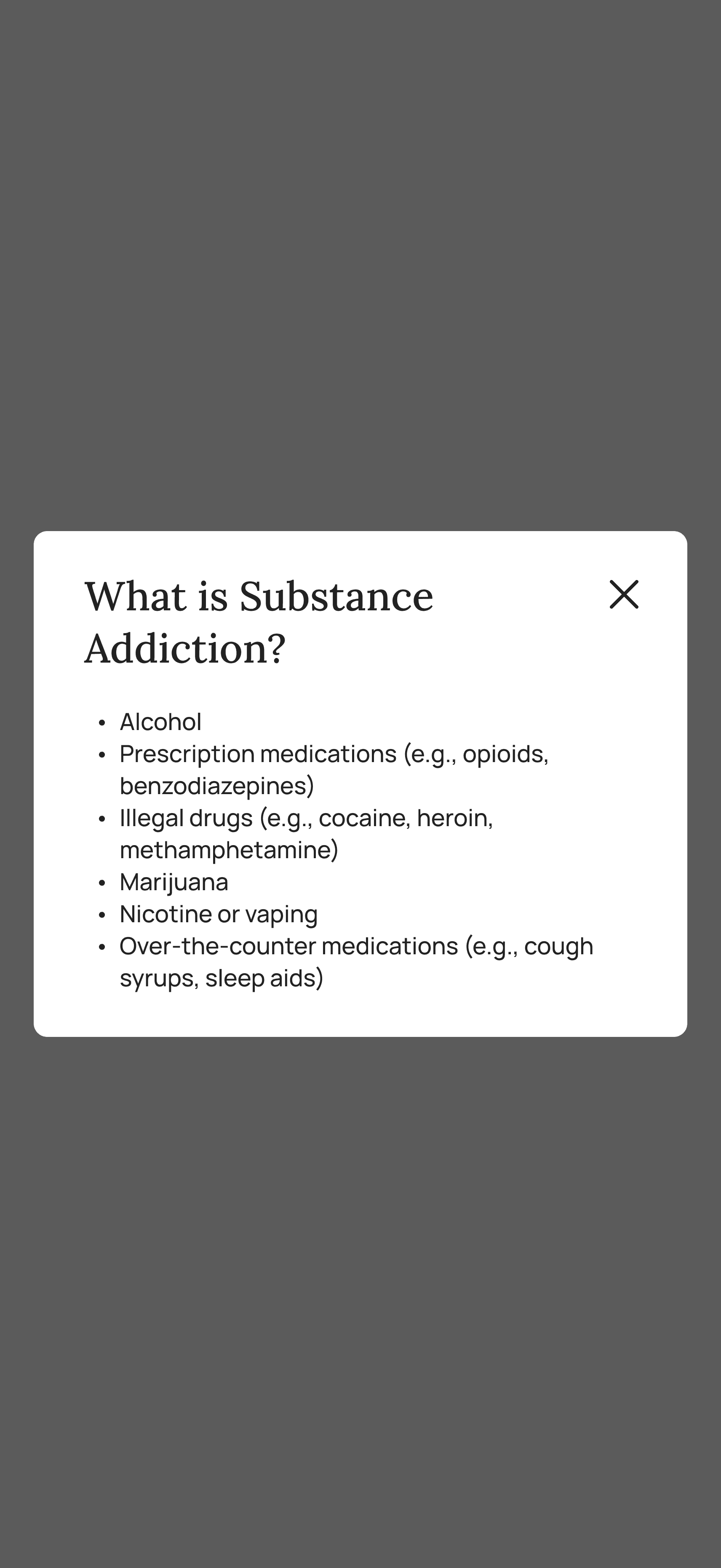
CHANGE #3: Our non-client partner wanted to list many user struggles in the onboarding quiz, but too many options made the UI feel overwhelming. I added an info icon to broader categories like "Substance Addiction," which opens a brief overlay when tapped.
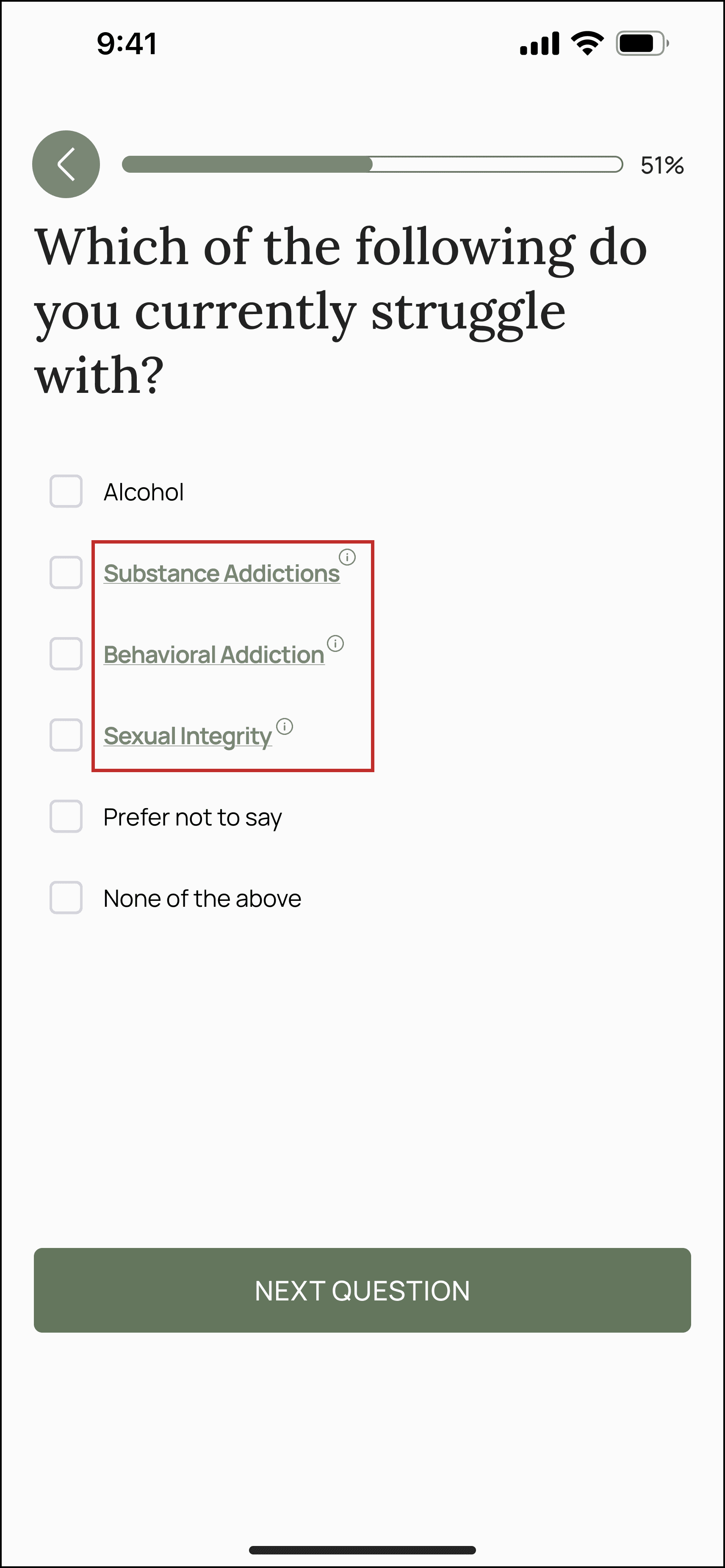
→
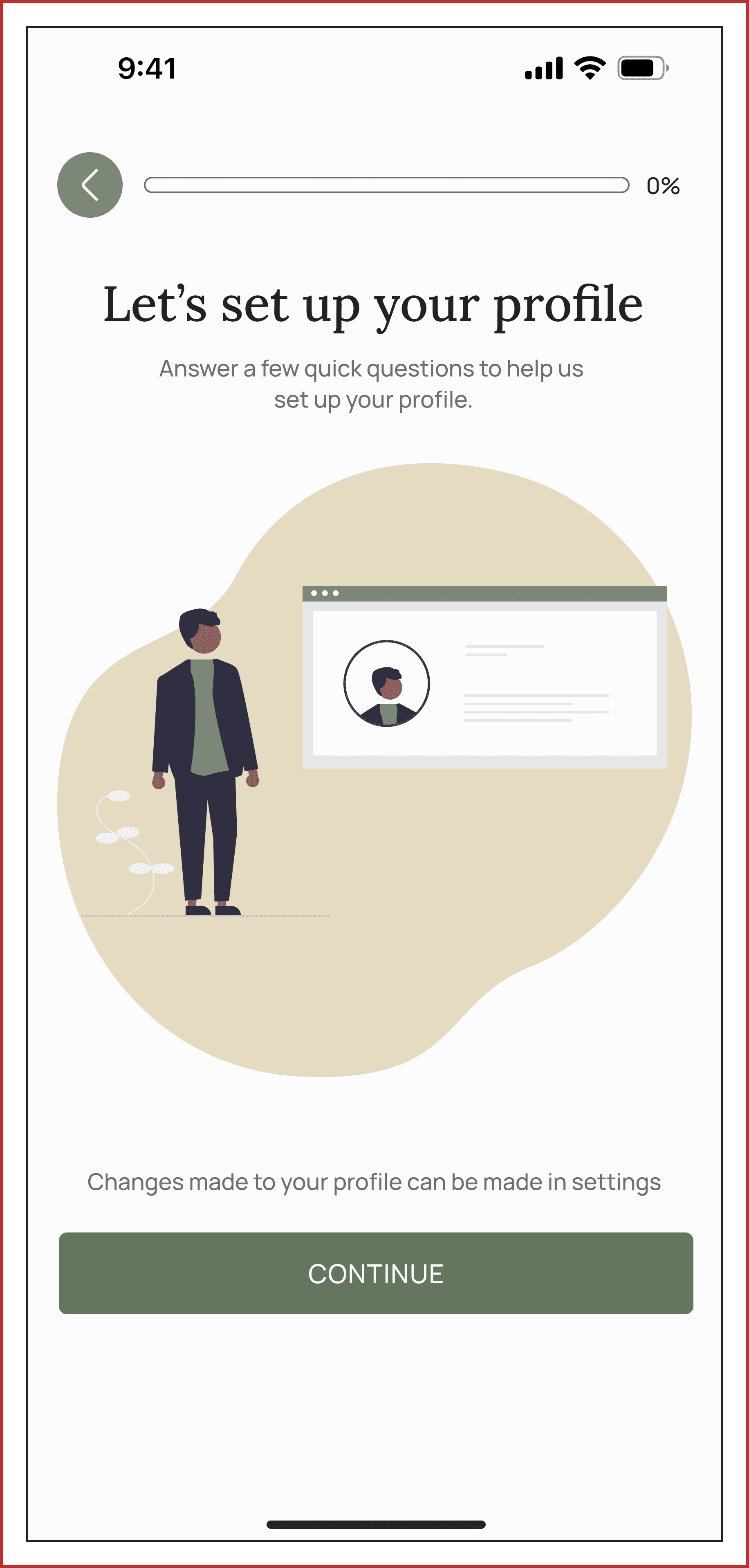
CHANGE #4: To improve onboarding, I reorganized the questionnaire into a section called "Let's Set Up Your Profile," grouping all profile-related questions together. This creates a clearer, more focused path for users to personalize their app experience, making the process more intuitive.
PROTOYPING
PUTTING IT ALL TOGETHER
Signing up:
Onboarding Quiz:

Profile Setup:

MORE HIGH FIDELITY DESIGNS
These screens were made by other designers on the team and you can see how some of them flow together in the following prototype. Although I didn't work on these, I wanted to show the breadth of features we had.
Resource View:
Event View:
Dashboard View

Set Milestones:
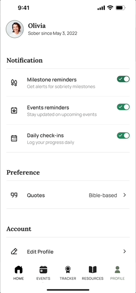
User Profile:
FEEDBACK
CLIENT SATISFACION
Kind words from our client
Stephanie Nashert
Founder of Stone Dry
Working with Develop for Good to build the Stone Dry app was an awesome experience. Our team is so talented, super patient, and just overall great to work with. From day one, they really listened to our vision and brought it to life in ways we didn’t even think of. The communication was solid the whole way through, and their attention to detail made a huge difference.
NEXT STEPS
DELVERY
Moving from 0 to 1 in App Development
As the design team, we’ve laid the foundation for the mobile app by creating a comprehensive design system and detailed documentation to guide the next phases of development.
To measure the success of the project, we will track the following Key Performance Indicators:
Successful user registration for events through the newsletter
Time spent on the app during first interactions
Frequency of user engagement with the app on a weekly basis
Number of donations made via the app
TAKEAWAYS
WHAT LESSONS DID I LEARN?
➿ Embrace the loops along the way
While attempting to hone in on specific concepts, we found ourselves consistently branching out into additional ideas. Ultimately, we opted to concentrate on the most crucial aspect: addressing user issues, and formulated respective resolutions for each.
💻 Design-to-development handoff
Through this experience, I gained a deeper understanding of the design-to-development handoff process. I learned the importance of systematically naming components within libraries and using auto-layout to ensure accurate paddings and margins.
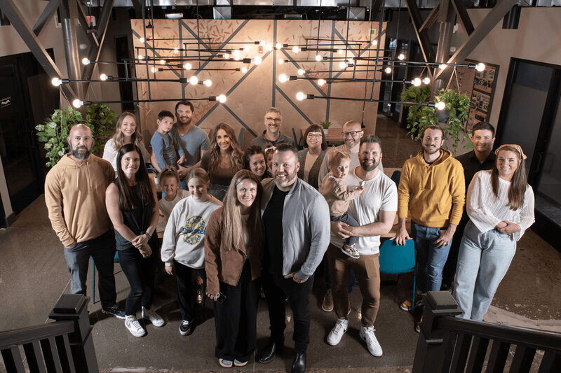
Big shoutout to my awesome team!

